A Brutalist typeface?
Those who write well about Brutalism describe it as an “ethic”, as much as an “æsthetic”. Reyner Banham, one of England’s most influential writers on architecture and design, summarized the charactheristics of the emerging style in his 1955 essay “The New Brutalism”:
“1, memorability as an image; 2, clear exhibition of structure, and 3, valuation of materials for their inherent qualities ‘as found.’”
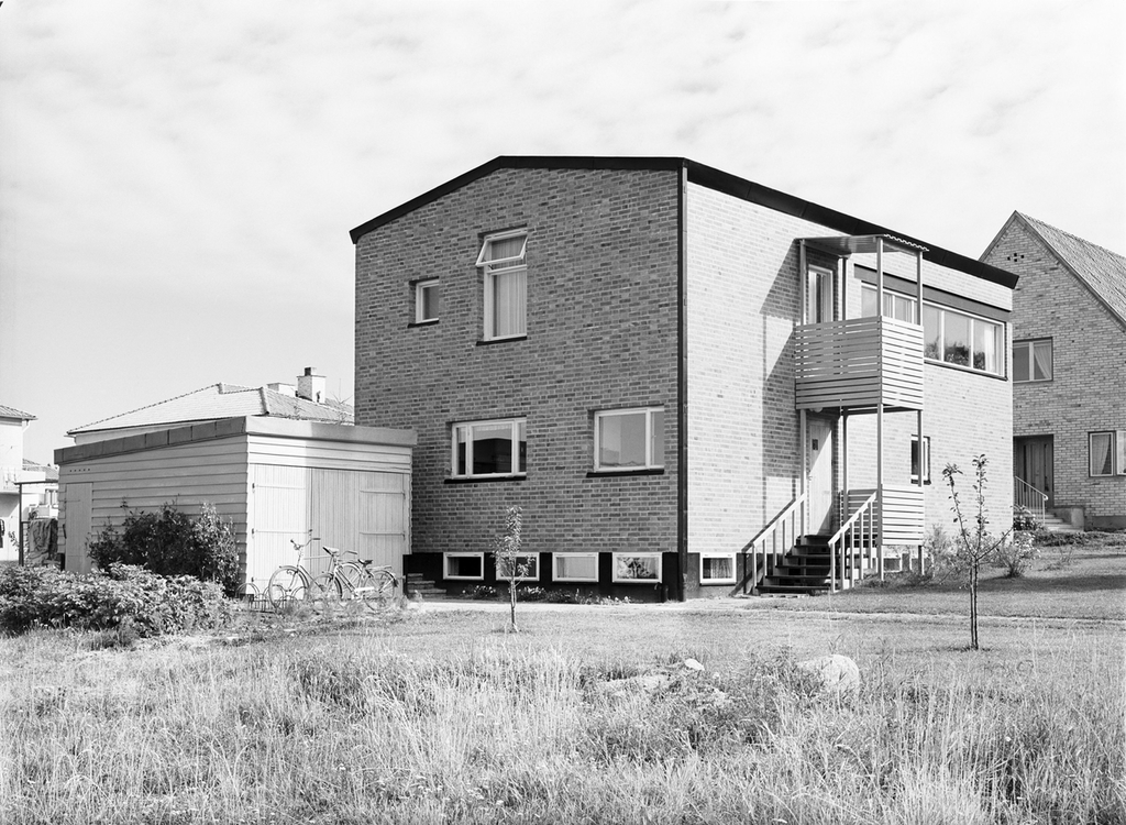
Hans Asplund first coined the term “Nybrutalism” in 1950 to describe Bengt Edman and Lennart Holm’s Villa Göth. (Photo: Sweden’s National Centre for Architecture and Design.)
Brutalism is the logical end point to Modernism, after which follows Postmodernism. The Modernist æsthetic is at its most extreme in Brutalist architecture. To young readers “Brutalism” is synonymous with monumental constructions, repetitive modular elements and raw concrete, but when Hans Asplund first coined the term “Nybrutalism” in 1950, the house he described, Villa Göth, was actually made from brick. Further detached still is the recent trend of “Brutalist design”.
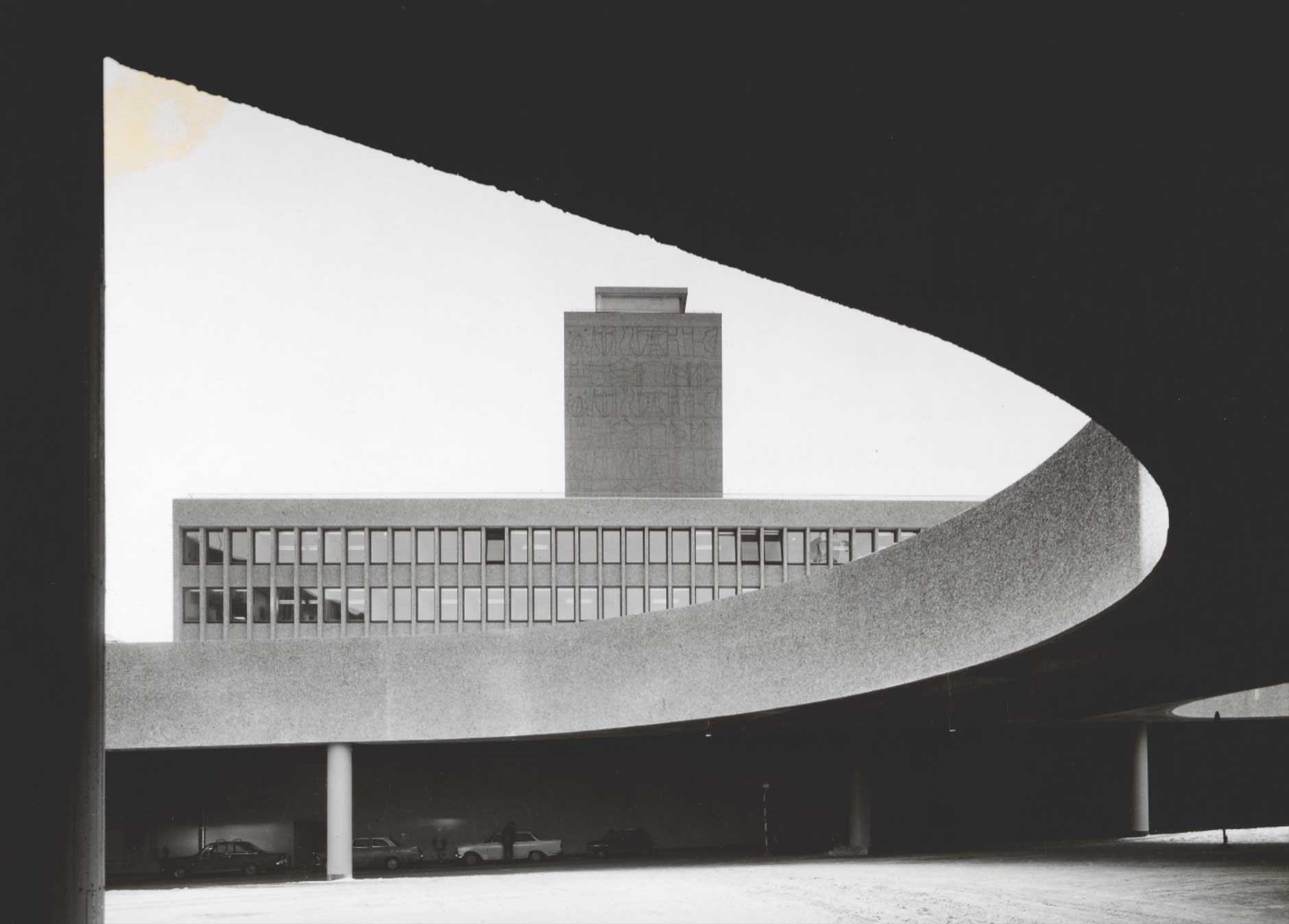
The demolition threat to Erling Viksjø’s Y-building was what sparked the typeface, and as such imposes its only limitation: The letter Y gets its shape from the building. From this, a set of design principles for an alphabet can easily be derived. According to traditional norms of type design, we can surmise the following:
- The stroke thickness is monolinear.
- Where multiple strokes meet, monolinearity is discarded and the strokes allowed to grow together organically.
- Inner corners are rounded.
- Diagonals terminate perpendicular to the direction of the stroke.
So, why does Viksjø ignore the rules?
Erling Viksjø’s Y-building, completed in 1969. (Photo: Teigens Fotoatelier/DEXTRA Photo, Norsk Teknisk Museum. )
Y
The letter Y from Viksjø.
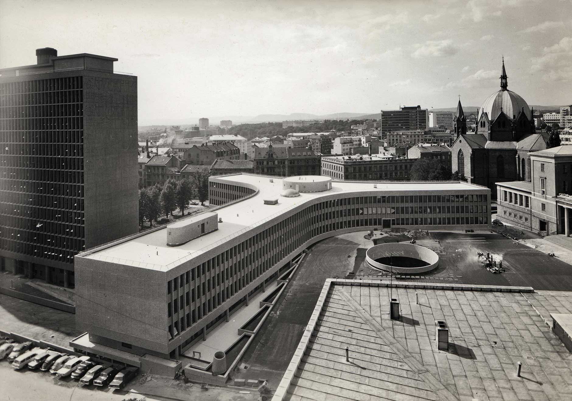
Enter the “ethics”. The Y-building is not a stand-alone shape. The Government quarters, to which it belongs, is conceived as a whole – including the art (Y features two Picasso originals and the surrounding buildings are decorated by artists like Tore Haaland, Carl Nesjar, Inger Sitter, Odd Tandberg and Kai Fjell – their artworks etched in concrete using Erling Viksjø and Sverre Jystad’s patented sand-blasting method, Betograve). Perhaps if he were a type designer, Erling Viksjø would construct the quarters following a single unifying graphic principle. What the buildings share, however – more so than any formal characteristics – is a certain defiant energy. It was this energy I sought to capture with Viksjø.
I don’t think the “spirit” of an object is best translated to typographical form by slavishly copying its characteristics in two dimensions. In other words, I do not think it makes sense to call a typeface Brutalist just because it mimics a Brutalist building. So, instead of following the traditional norms of typeface design, I decided to explore Banham’s ethical and æsthetic principles:
M J Ø G E
1) Memorability as an image: I searched for monumental letterforms echoing Y’s energy. The E resists all expectations; the length and distribution of its horisontals are off-kilter. The Ø slash is much steeper than normal. The J is narrow, and the M painfully wide. Rule violation is perfectly in line with Banham’s linking of Brutalism to Art Brut. Considering their monumental qualities led me to imagine letterforms as three-dimensional monolithic structures with façades and courtyards.
W A V E
2) Clear exhibition of structure: Viksjø uses optical tricks – usually employed by type designers to make letters deflect attention – for their opposite purpose, to attract attention. The top of A is narrow, making its counter uncomfortably small. The corresponding vertex in V would normally be the narrow one, but in Viksjø it is extended to make the V appear unusually wide. Similar features are treated in the same contradictory manner throughout, revealing the nuts and bolts of letter construction.
K R U X
3) Valuation of materials for their inherent qualities ‘as found’: This principle is not easily translated into type design. What are the inherent qualities of Bézier curves? Anything a pen can write, curves can reproduce. Certain characteristics, however, are more natural to writing: the angle of attack, the distribution of thicks and thins, the rhythm, the rotational symmetry, and the repetition of formal characteristics. Can a Brutalist typeface afford to be detached from these natural habits of writing to a greater extent than a more traditional typeface? A traditional approach might be to repeat the rounded inner corners from the Y-building in all letterforms. I chose instead to use them only sparingly – where they served to highlight and strengthen a characteristic shape. Similarly, Viksjø’s strokes are allowed to terminate both perpendicularly and horisontally.
J 2 P R B
Erling Viksjø (Photo: Private)
And, 4) – beyond Banham’s list of principles – I incorporated the repetition of modular elements. My crossbar height is uniform throughout most of the alphabet. E, F and L are drawn on the exact same measures, as is the rounds (O, Ø, Q) and the bowls of B, R, and P. The traditional 180 degree rotational symmetry gives way to a more liberal approach, as in the numeral 2 and capital J – constructed from the rotated bowl of P.
Viksjø is my quickest design to date. The idea hit me in the demonstration march on October 24, and the typeface was released on November 1st. Its limited character set – Viksjø is available in capitals only – is thus a conscious decision to speed up the production. Viksjø is an urgent protest against the looming demolition of Erling Viksjø’s Y-building, but it is also a critique of Brutalist graphic design. I do not know if I dare label Viksjø a true Brutalist typeface just yet, but I do think it points toward an approach that is more firmly grounded than most graphic design flying the Brutalist flag. Given more time, I’d try to stick even closer to Banhams’s principles. Perhaps I’d even dare discard the ampersand altogether – it is, after all, an unnecessary ornamentation for the true Modernist.