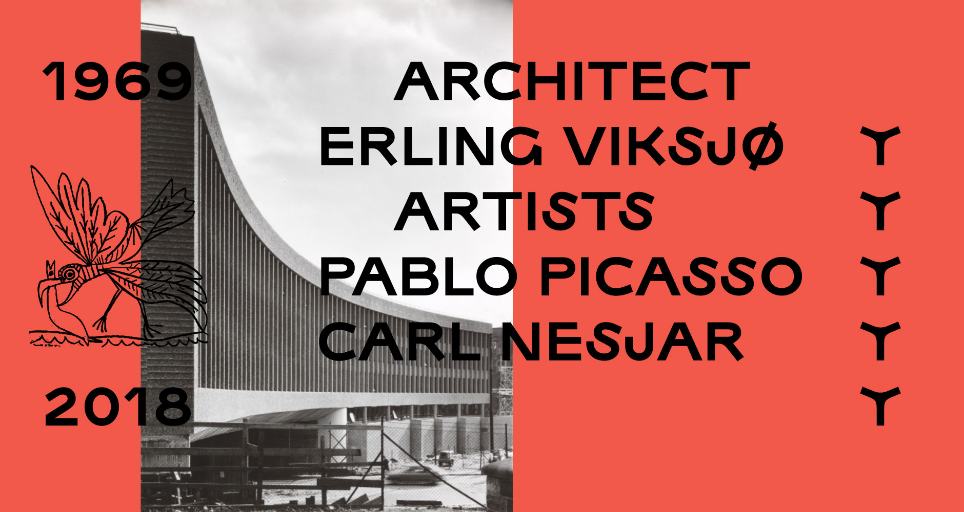
Let Y live!
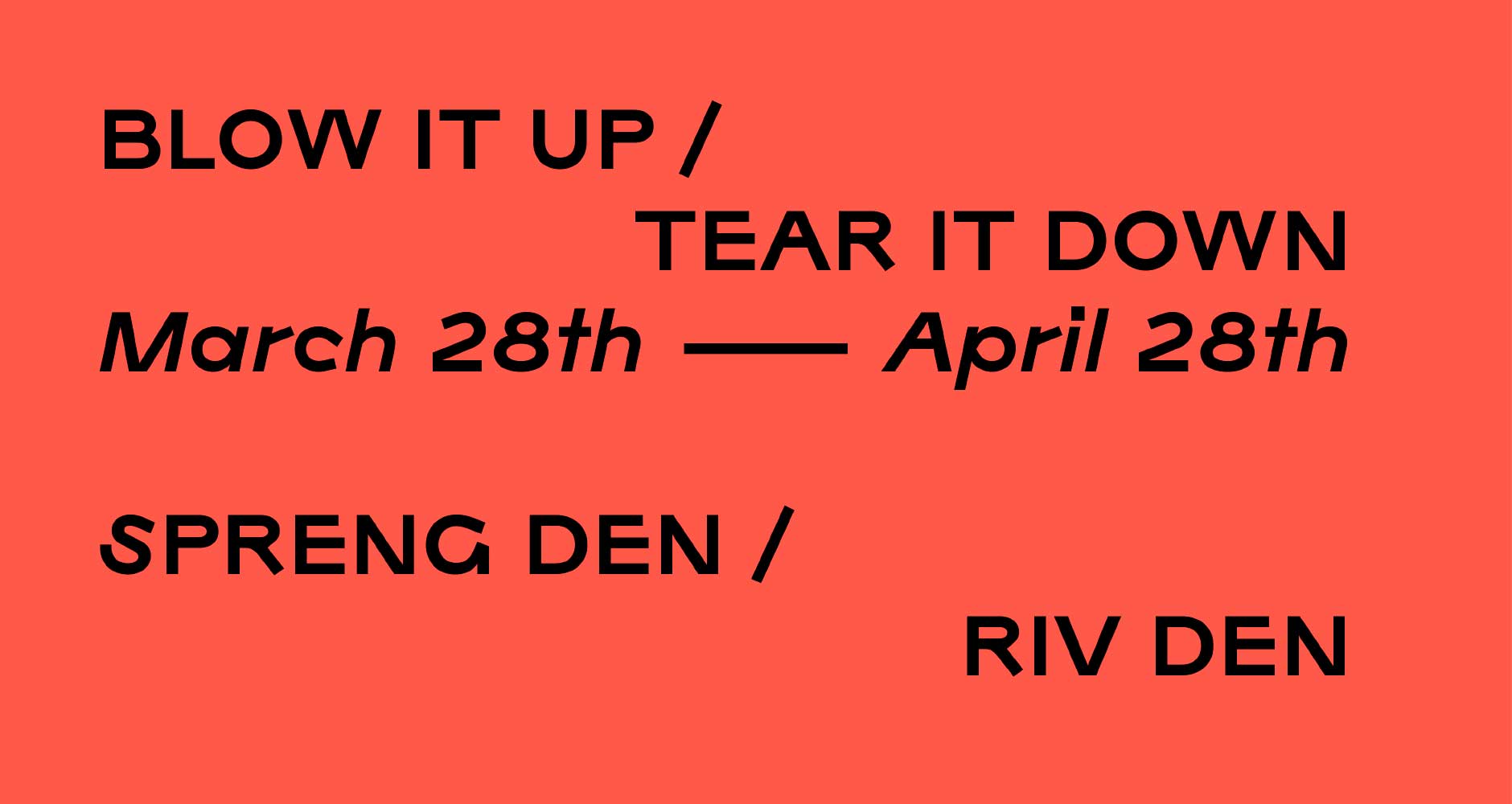
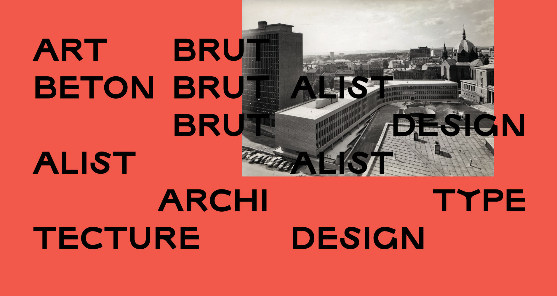
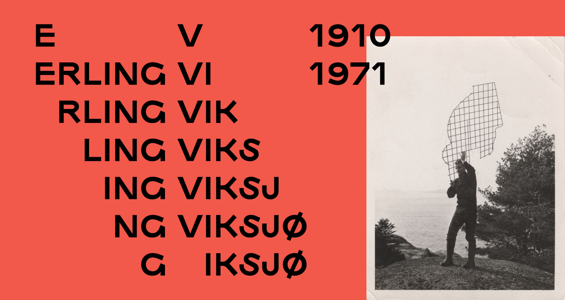
In Viksjø, designer Frode Helland attempts to translate the ethical principles of Brutalist architecture into letterforms. The typeface was cast in raw concrete and showed as part the exhibition Blow it Up/Tear it Down, an artist protest against the demolition of architect Erling Viksjø’s seminal Y-building. Through the writings of architecture critic Reyner Banham, the Viksjø typeface explores the depths of Nordic modernism.
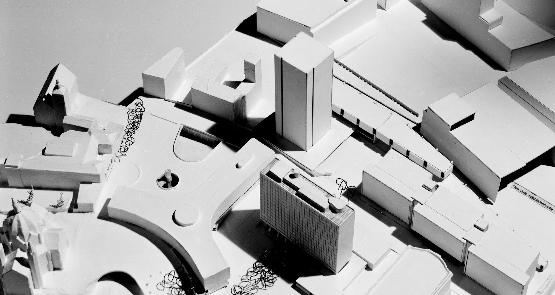
The Y-building and surrounding Norwegian government quarters was the target of the 2011 Oslo terror bombing. The Y-building was scheduled for demolition in 2014, against vocal opposition from leading architects and The Directorate for Cultural Heritage. Y was finally demolished in 2020.
Viksjø is not your typical Monokrom typeface. Its cause is as urgent as its production. Improvements and additions are only gradually added. In April 2109 the typeface was expanded with lowercase and a matching italic style.
Please refer to the specimen PDF for character set details.