The cult of the sans serif
The debut of the neo-grotesk was also the precise moment of its ideological demise. Motorik from Monokrom offers a new perspective on this formative moment in design history: the immediate neutralization and appropriation of the democratic ambitions central to modernist thinking on the eve of its birth.
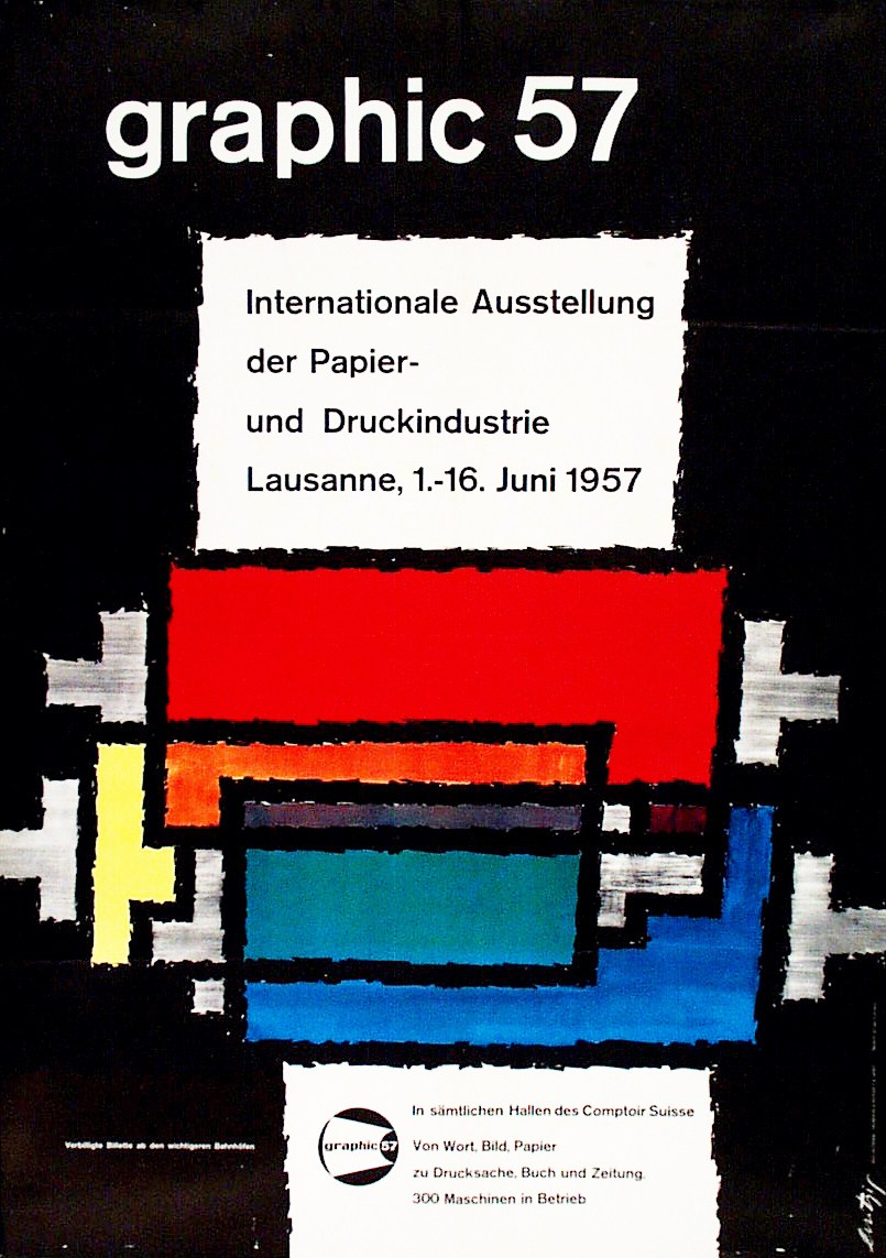
Poster for the Graphic ’57 trade fair in Lausanne, designed by Ernest Witzig.
The postwar neo-grotesk is a monolinear sans serif with a static, symmetrical construction. Vertexes, spacing, and diagonal angles are unified, and the characters are constructed around a center point – its details and metrics methodically planned out on a rectilinear grid. The neo-grotesk makes subtle adjustments for optical effects and historical broad-nib writing patterns, looking to the fourth- and fifth-century half-uncial for its vertical axis and horizontal termination of strokes. Apertures line up across characters, referencing the alignment of vertical serifs in traditional serif models. The resulting formal characteristics are all found separately in earlier models, but had never before come together as a holistic approach to type design.
In developing Motorik over a period of five years, Monokrom examined and reconsidered these principles and their application across a large spectrum of styles. Motorik challenges the notion of the neo-grotesk as merely a collection of stylistic markers, reconsidering it instead from an ideological perspective.
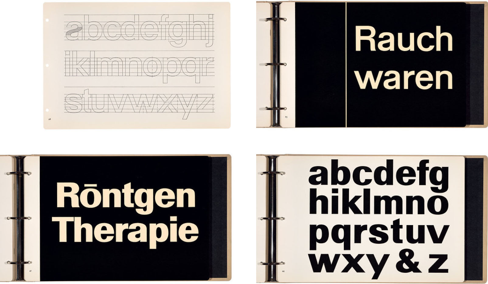
Walter Käch’s Schriften Lettering Écritures grounds the modernist sans serif in logical reasoning and historical precedent.
The neo-grotesk offered the potential for a radical dismantling of the designer ego, replacing hero worship and hierarchy with rational construction principles made available to anyone. It reimagined cultural expression as a new communal neutral with no clear geographic origin, and without the baggage that burdened nationalist style after World War II. The impetus for the modernist neo-grotesk was a collectivistic ideal, subservient to context and drawn from the system inward.
Hannes Meyer, the second forgotten director of Bauhaus, exemplified the democratic ambitions of modernism: Meyer detested the hero-driven, top-down ideology that he inherited from Walter Gropius, and insisted on working collectively, drafting modest architecture for everyday people. In a lecture at the Academy of San Carlos in Mexico City in 1938, he proclaimed: “[W]e should [...] condemn that type of architect for whom the building of a house is merely an opportunity to parade personal formal preferences for all the street to see.”
These are ideas far removed from the modernism that graphic design education presents us with: a cavalcade of great men imposing their taste on the world, an ideology where the designer always plays the starring role. It is a narrative that leaves little room for radicals like Meyer.
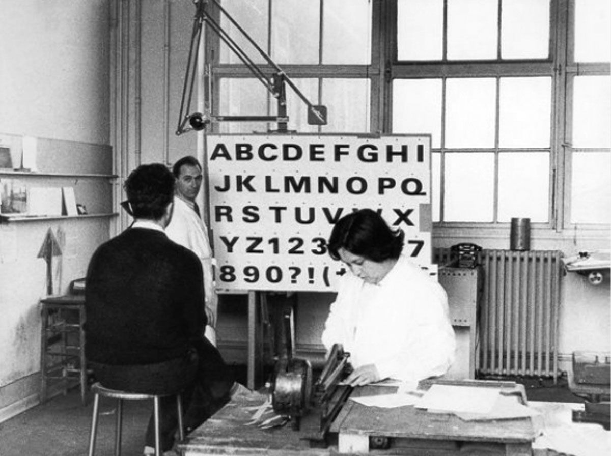
Univers, designed by then 29-year-old Adrian Frutiger, was the first mature typographic manifestation of Walter Käch’s ideas for a new grotesk. It was released by the Deberny & Peignot foundry in 1957.
The Graphic ’57 trade fair in Lausanne debuted Adrian Frutiger’s Univers type alongside two competitors, Eduard Hoffmann and Max Miedinger Neue Haas Grotesk and Folio by Konrad Friedrich Bauer and Walter Baum.
Whereas Univers was released as a large spectrum of coordinated styles, Neue Haas Grotesk (later renamed Helvetica) offered only one. It was developed in response to Frutiger’s sans serif, with one clear goal: winning. “Ours will be better,” Eduard Hoffmann wrote in a letter to Max Miedinger on March 22, 1957.
Univers was drawn from the system inward. Helvetica was drawn from the desired style outward. One represents the politicization of aesthetics; the other, the aestheticization of politics.
Today, sans serif sommeliers revive and reinterpret neo-grotesks with increasingly granular discernment. In clamoring for an aura lost to mechanical reproduction, their work is meticulously staged and curated – every reference and handshake vetted to uphold the pretense of cult value. This incessant appeal to authority is what led Walter Benjamin to characterize the “old art” as essentially fascist at its core.
The flawed concept of a “neutral” defined and imposed upon the world by privileged white men has already been discussed ad nauseam: there is Helvetica Greek, Helvetica Arabic, but never a Helvetica Latin – an invisible default left for coming generations to dismantle. Critics of modernism have done little to disentangle this mess. Rather, contemporary design culture only seems to have accelerated the cult of personality and the reliance on hierarchy to discern value.
What characterizes both approaches is the centering of the designer as the real motif of their work. As one anonymous critic so poignantly put it: “The Designer doesn’t design, he designs himself designing.”
More than anything, Motorik offers an occasion to shine a light on these mechanisms – a reminder that modernism used to be about something more than style.