Condensed
The Condensed family is an ongoing exploration of display typography delineated by spatial constraints rather than formal resemblance.
Motivated by the growing advertising needs of industrial production, 19th century printing saw a surge of attention-grabbing type, intent on filling the paper with the maximum amount of ink. The great variety of expression that resulted rarely extended to the condensed faces, where limited space for maneuver imposed a predictable appearance.
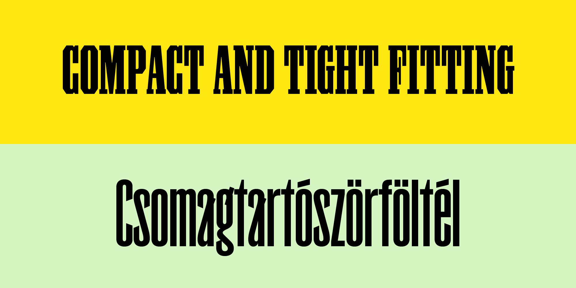
Bold, narrow and aggressively stylised, Condensed Grotesk is a compact sans serif in three variants, reinvigorating a mainstay tool of blue collar worker-printers. Condensed Grotesk navigates its limitations with determination, confidently distributing vestige and mannerisms across a broad character set. The sharp interior corners dissolve in context, softening the digital precision, and open shapes combine to form strong areas of white space countered by the black crowding of diagonals.
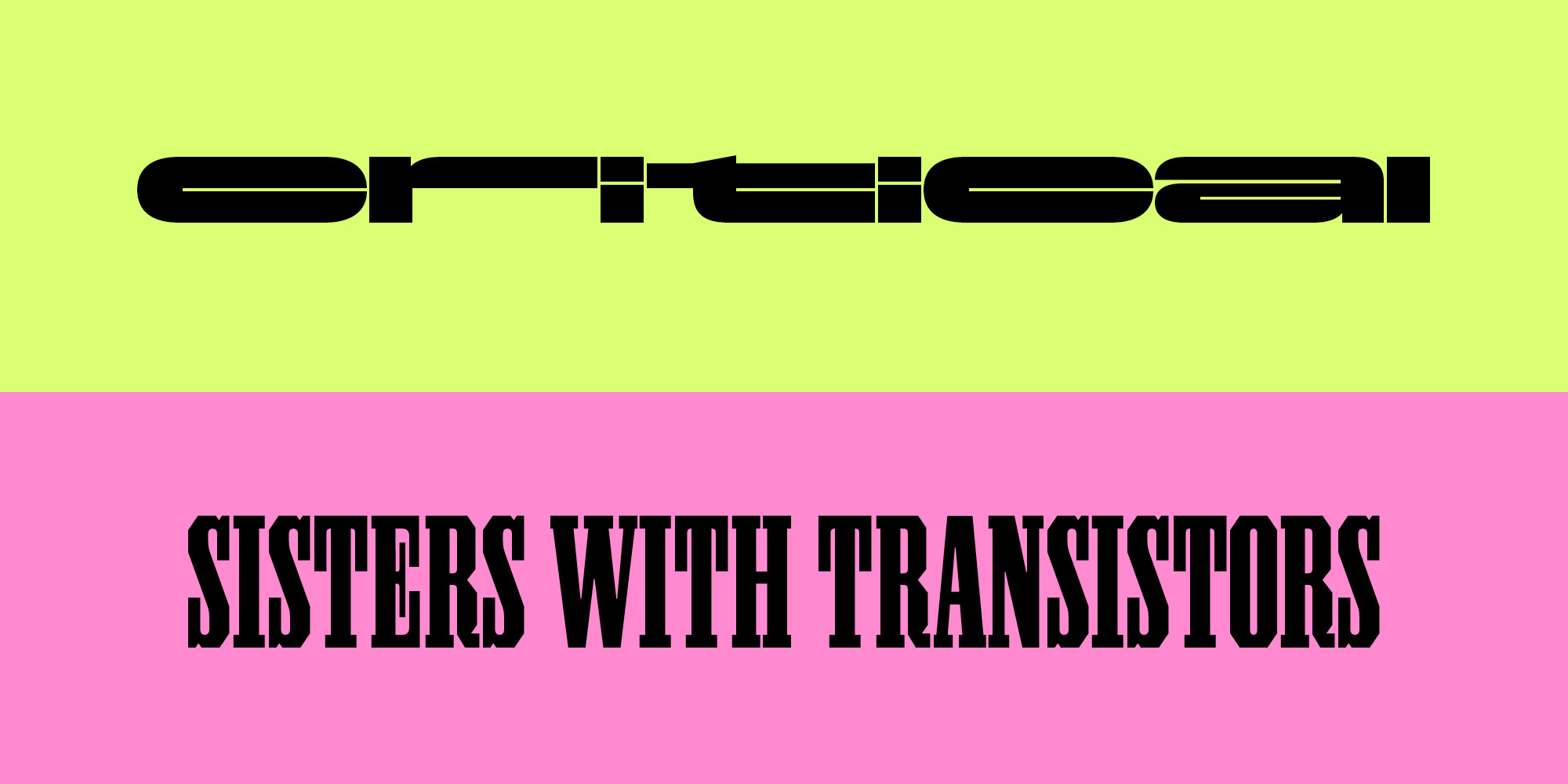
Condensed Alcubierre turns a compact grotesk construction 90 degrees on its side for an ultra-extended slab-like appearance. Alcubierre is narrow in the wrong direction – as if elongated by time dilation.
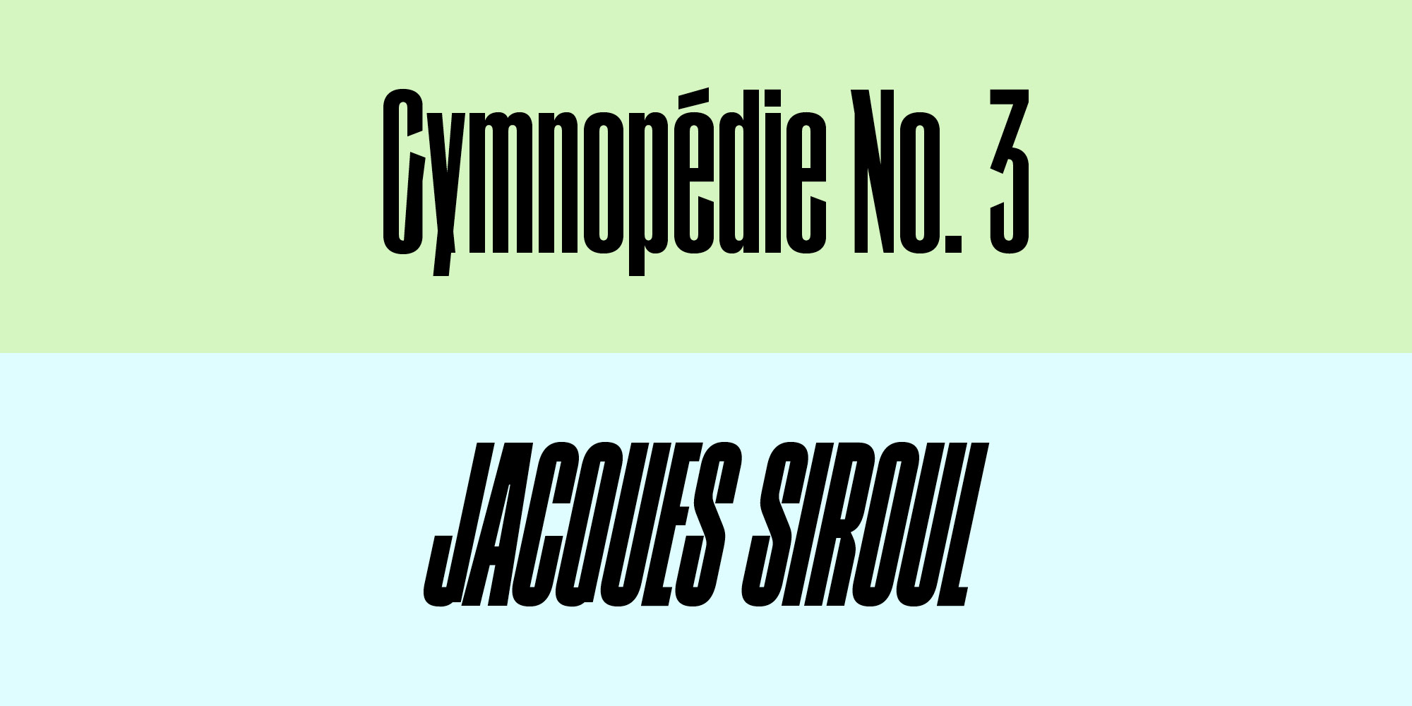
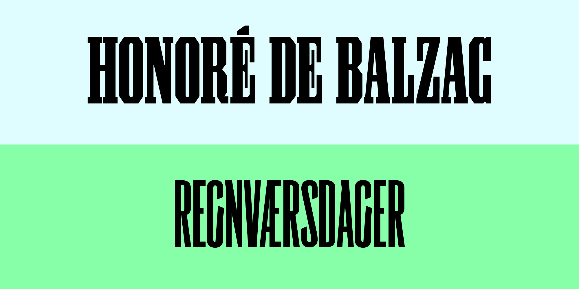
Condensed Antique is a revival of the Lettres Egyptiennes Allongées, a narrow slab serif, drawn in its largest sizes solely with straight lines. Three of these (57.5, 75, and 100 mm) are shown shown in Laurent et Deberny’s type specimen Lettres pour les Affiches (Fonderie de Laurent et Deberny, ca. 1830–39).
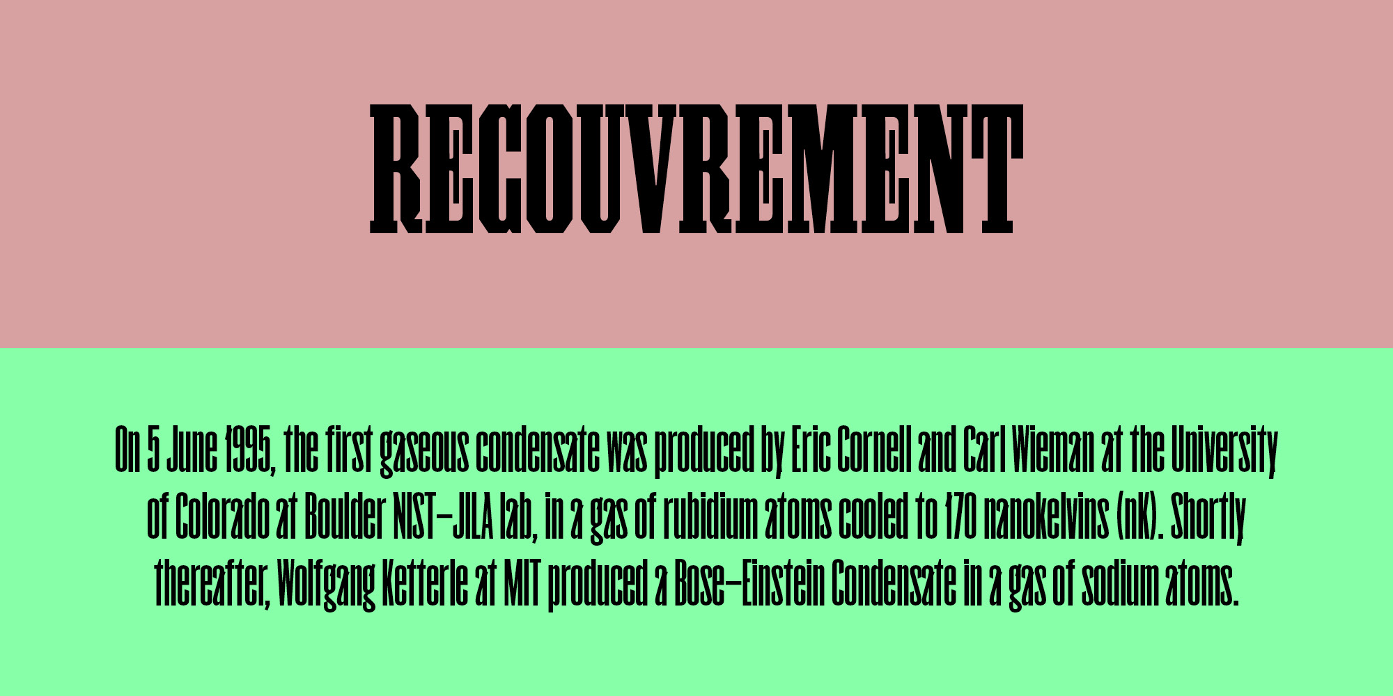
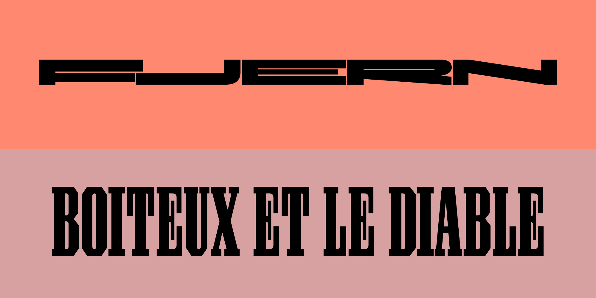
With its pronounced diagonally sliced terminals and tapered connections, Condensed Garland is playing up the hallmarks of a late 19th century grotesk. Garland’s terminals finds their counterpoint in the most surprising of details: diagonals cut through the letter to create protruding spurs. In the ear of the lowercase “g” it is suggestive of a writer’s hand, and in the staggered diagonals of “A” it alludes to an incised Roman letter.
We offer active support for over 200 languages. Read more about our character set.