Dewey Decimal
Dewey Decimal is a contemporary reimagining of Documentary, a proportional typewriter style for the Friden Justowriter teleprinter. The large x-height, coupled with unfurling enclosed spaces, result in wide apertures that breathe fresh air into a self-contained Neo-classical construction.
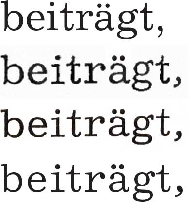
Excelsior by Chauncey H. Griffith, published in 1931 by the American Mergenthaler Linotype Company; Friden’s Documentary Type; Stempel’s IBM Dokument; and Dewey Decimal.
Documentary was a proportional typewriter font available with the Friden Justowriter. The Justowriter was the professional equivalent of Friden Flexowriter, a tape controlled electric typewriter manufactured by the Commercial Controls Corporation in the 1960s. A similar design was offered with the IBM Executive typewriter as IBM Dokument, both systems fitting its characters onto four predefined widths measuring 2, 3, 4, or 5 steps at 1/32″ size. In Dewey Decimal, the unitized widths are shared across all variants, leaving breathing room for the generous sweeping curves of the italics. The limited fidelity forces the design into unusual proportions, albeit less so than monospaced typewriters.
Both Documentary and IBM Dokument appear to be adapted from Chauncey H. Griffith’s Excelsior, exhibiting its telltale beaked /g/ ear and agape /a/. Excelsior was released in 1931, the second of five serifs to form the Legibility Group. The American Mergenthaler Linotype Company toted the series as superior typefaces for newspaper printing, a marketing ploy that enjoyed great success.,
Excelsior follows a template established by nineteenth century “Didones”: An upright contrast axis, ball terminals and the precisely curled details afforded by higher precision in tools and reproduction techniques. Low-contrast interpretations were variously labeled “Clarendons”, “Egyptiennes” or “Ionics”. Griffith’s main intervention in the genre, according to the promotion, is the openness of counters said to increase legibility, developed on advice from optometrists.
While Mergenthaler Linotype cites the older Miller & Richard’s Ionic as its main inspiration, critical voices pointed out the similarities with a contemporary competitor: Century Expanded, another low-contrast Didone offered by American Type Founders that displays a similar openness and directionality.
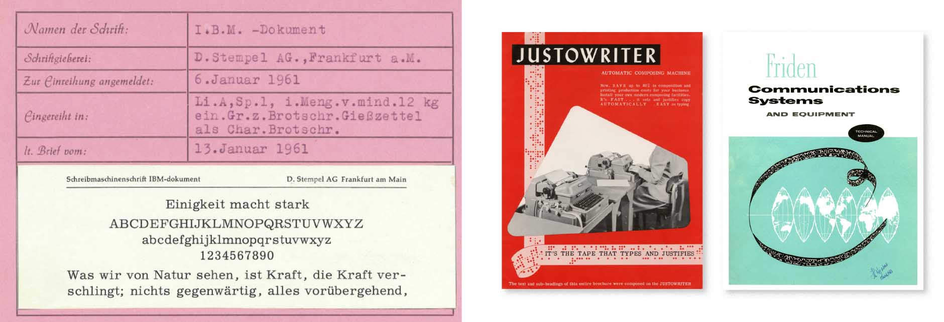
Sample showing of IBM Dokument from D. Stempel A.G., 1961; Manuals for the Friden Justowriter and the Friden Communication System from the Commercial Controls Corporation, 1961.
The generous apertures and the soaring roof of lowercase /a/ are carried over into Dewey Decimal, but the new family diverges in its approach to the detailing. Despite Documentary only offering one style, Helland has developed the source material into a full family. Drawing from his own experience, as well as Documentary’s ancestors, the letterforms are infused with contemporary aptitude and individualized penchant.
Dewey Decimal is a family of six members: three roman weights and accompanying italics. Scope and technical execution follows contemporary standards. Dewey Decimal also includes a Vietnamese extension to the standard Monokrom character set, making it available to an even larger market.
Free trial fonts and licensing options are available now from Monokrom Skriftforlag.
Designers: Linn Boyd Benton, Morris Fuller Benton, Chauncey Griffith, Frode Helland
Released: 2023
Format: OTF, WOFF, WOFF2
Visuals: Benjamin Hickethier
We offer active support for over 200 languages. Read more about our character set.