The Search for
Extra-Typographical
Intelligence
On the design of Karelia
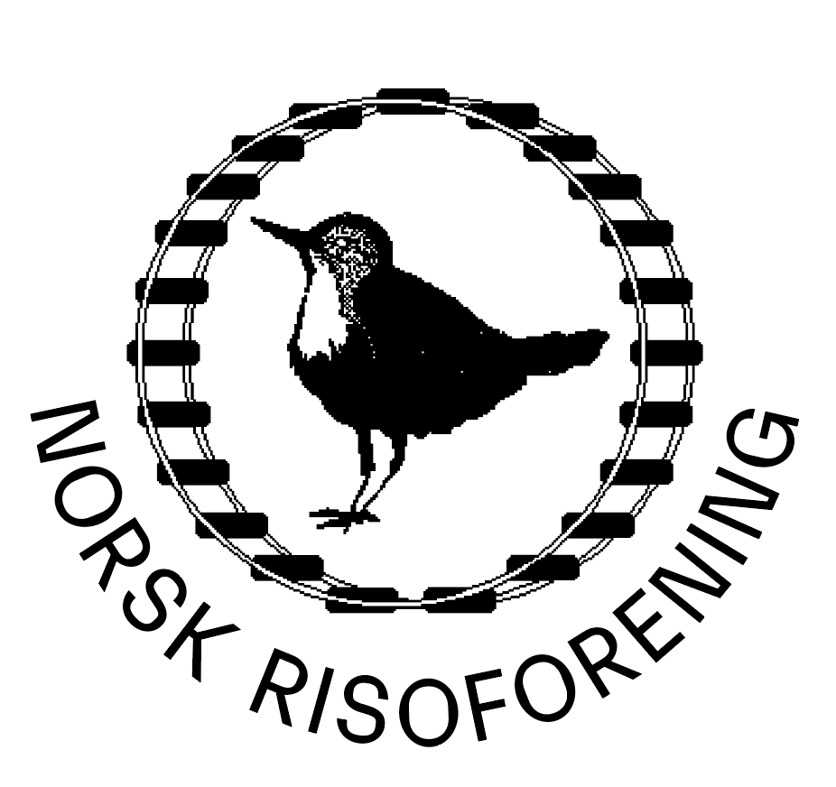
Norsk Risoforening, an early adopter of Karelia.
Originality in type design is a strange and fickle beast. The forms of letters are ruled by century-old conventions. How much can the shape of an ‘a’ change before it stops being an ‘a’, especially in a design that needs to be fit for general use? This conundrum leads some designers to draw unusual, showy glyphs for a few forgiving characters in otherwise fairly conventional designs, in the hope it will make the entire typeface stand out. This approach mistakes novelty for originality; the unconventional letterforms become a gimmick. If the identifying motif is not sustained throughout the entire character set, the only thing it achieves is attracting the attention to those key characters. The harder one tries, the more it becomes obvious it’s an artifice, a flourish, a mere sleight of hand.
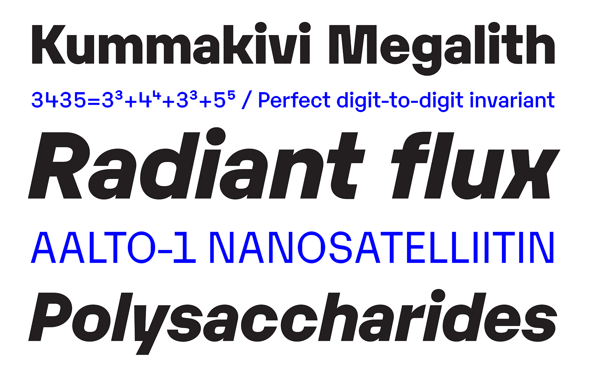
The accompanying type specimen PDF offers a closer look at Karelia.
Innovative type design doesn’t rely on superficialities, but reveals itself outwards from the inside. It is in the bone structure of the letters, in the architecture of the characters. Take for example the capital ‘K’ with a small horizontal stroke connecting the diagonals to the vertical stem, a trendy form that started cropping up in many sans-serif typefaces some years ago. Most often, it was a solitary element that appeared artificially inserted, as if it didn’t belong to the fabric of the design.
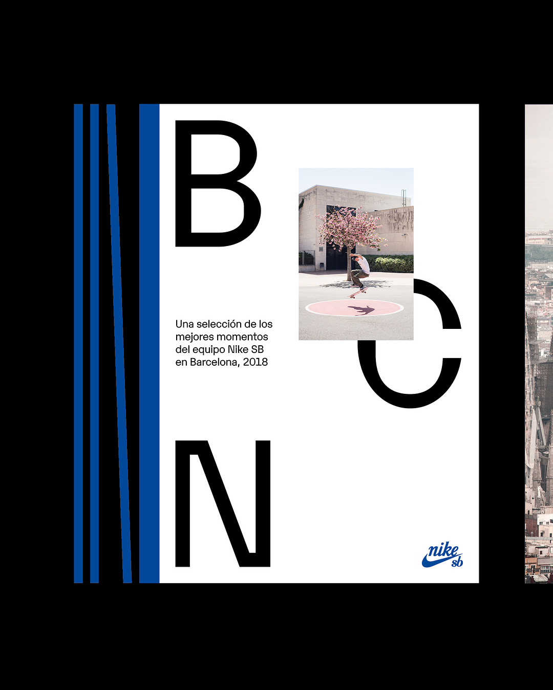
Nike SB BCN, a limited edition photobook and promotional poster, designed by Barcelona-based designer Jorge León. More at Fonts in Use.
With Karelia, Frode Helland proved it doesn’t need to be this way. The typical horizontal stroke became part of the core concept for the design. It was echoed in wide, dislocated corners and a flat top on the capital ‘A’. But how did this formal trait translate to round shapes? Approaching the inside and outside of the letters as distinct elements, Helland drew squarish counters in round forms to mirror the flat, horizontal motifs. This guarantees that the underlying design rationale is recognisable even in short words that only have very few letters.
The robust, often exaggerated forms of micro typefaces sometimes wind up looking quite dramatic rendered large, making them striking, successful display faces. Karelia shows this can also work the other way around. The square counterforms which give Karelia its aplomb in display use, also make it fit the pixel grid better. The bits and pieces of the puzzle Helland added to the design—the horizontal connections, the flat tops, the squarish counters—solve legibility problems in small sizes, making the face equally effective in running text.
The Karelia family offers an additional variant. Karelia Outtakes takes Karelia’s distinctive features and runs with them. By extending the horizontal joins, Helland emphasises those elements, turning them into a persistent visual motif. This exaggeration shifts Karelia Outtakes into expressionist territory. It is an unapologetically systemic design that produces arresting typography.
Instead of the usual “form follows function,” Karelia is an exciting example of “function follows form”: the typeface’s formal qualities define its possible uses. They dramatically broaden the design’s potential and scope, unexpectedly turning a display face into a micro type. How will users exploit this ambidexterity? Only time will tell.
Karelia is designed by Frode Helland. The production was assisted by Robin Mientjes, with input from Ben Mitchell, Craig Eliason and the Monokrom team. The Search for Extra-Typographical Intelligence graphics was conducted by Benjamin Hickethier under direction of Frode Helland.