Karelia
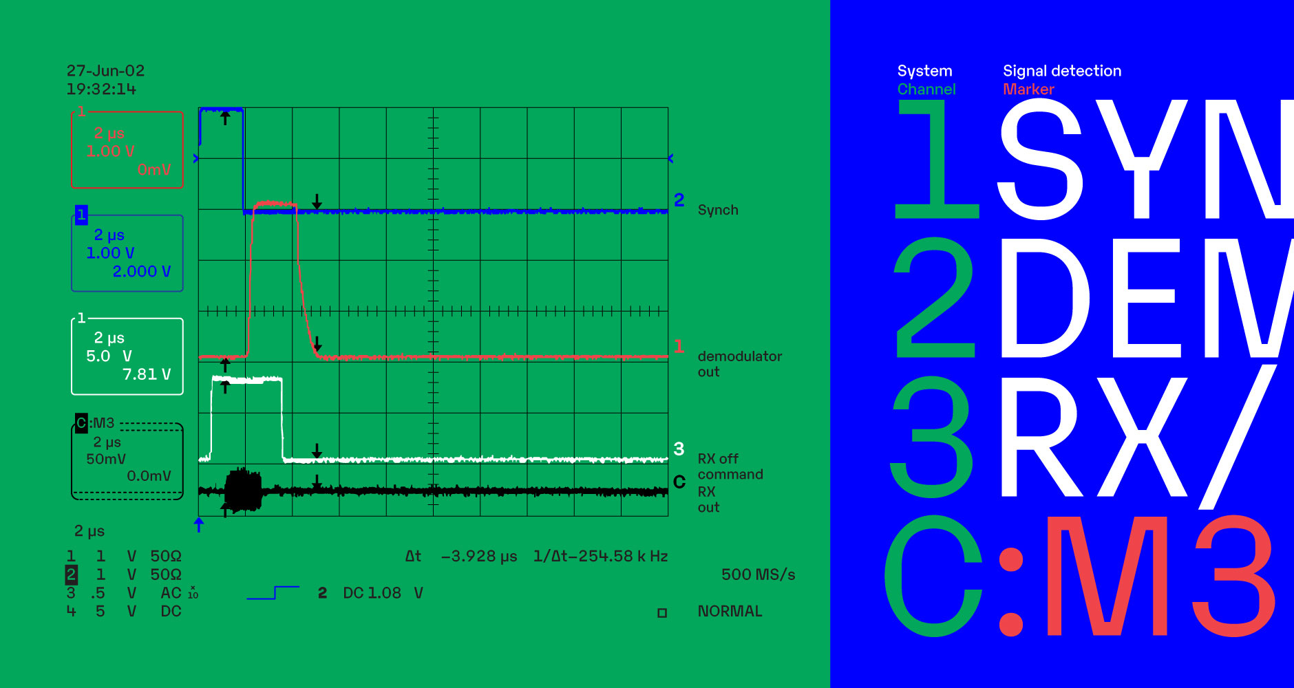
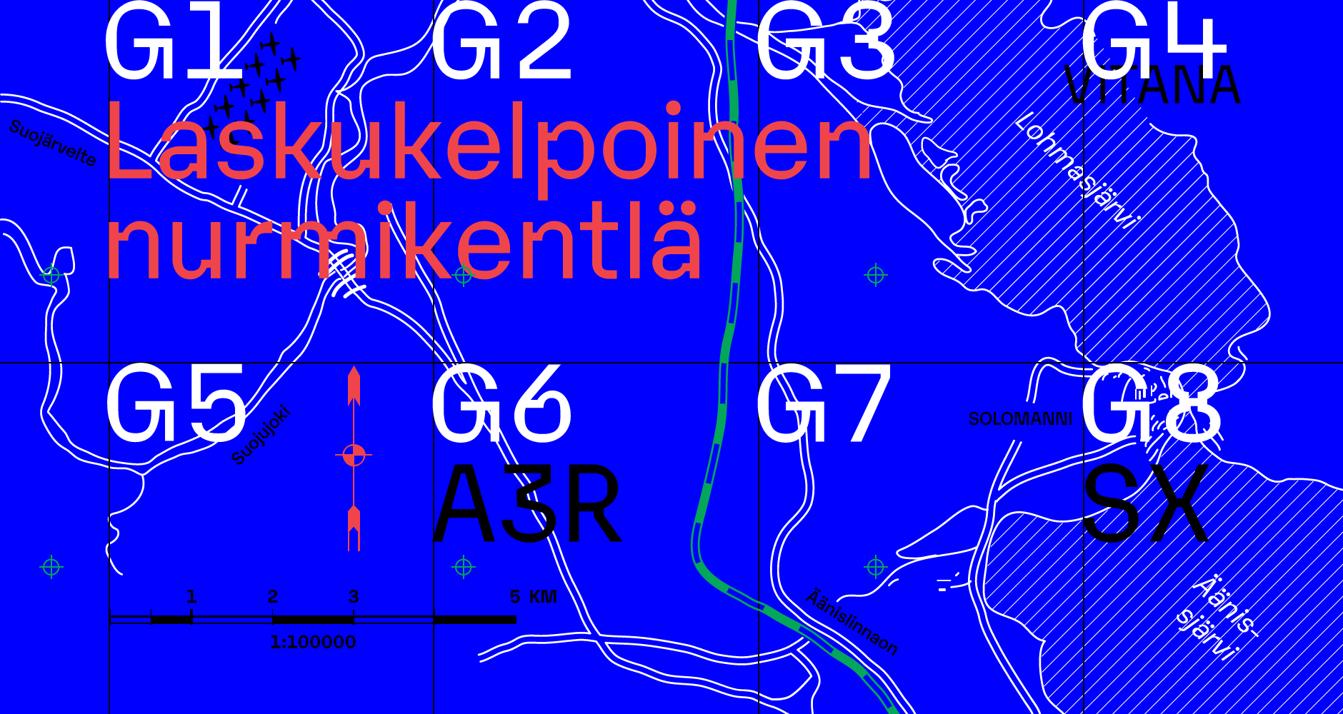
Karelia is a post-contemporary sans serif in four weights and eight nine styles, sporting a subtle mechanistic flavour. While its spacing, proportions and apertures are geared towards headlines, the details take cues from the opposite end of the spectrum: type designed for the smallest sizes. Karelia elevates these structural elements to an aesthetic role. Dislocated corners carve trapezoid ink traps, echoed by the squared-off counters. The resulting look is conventional in small sizes but expressive when set large.
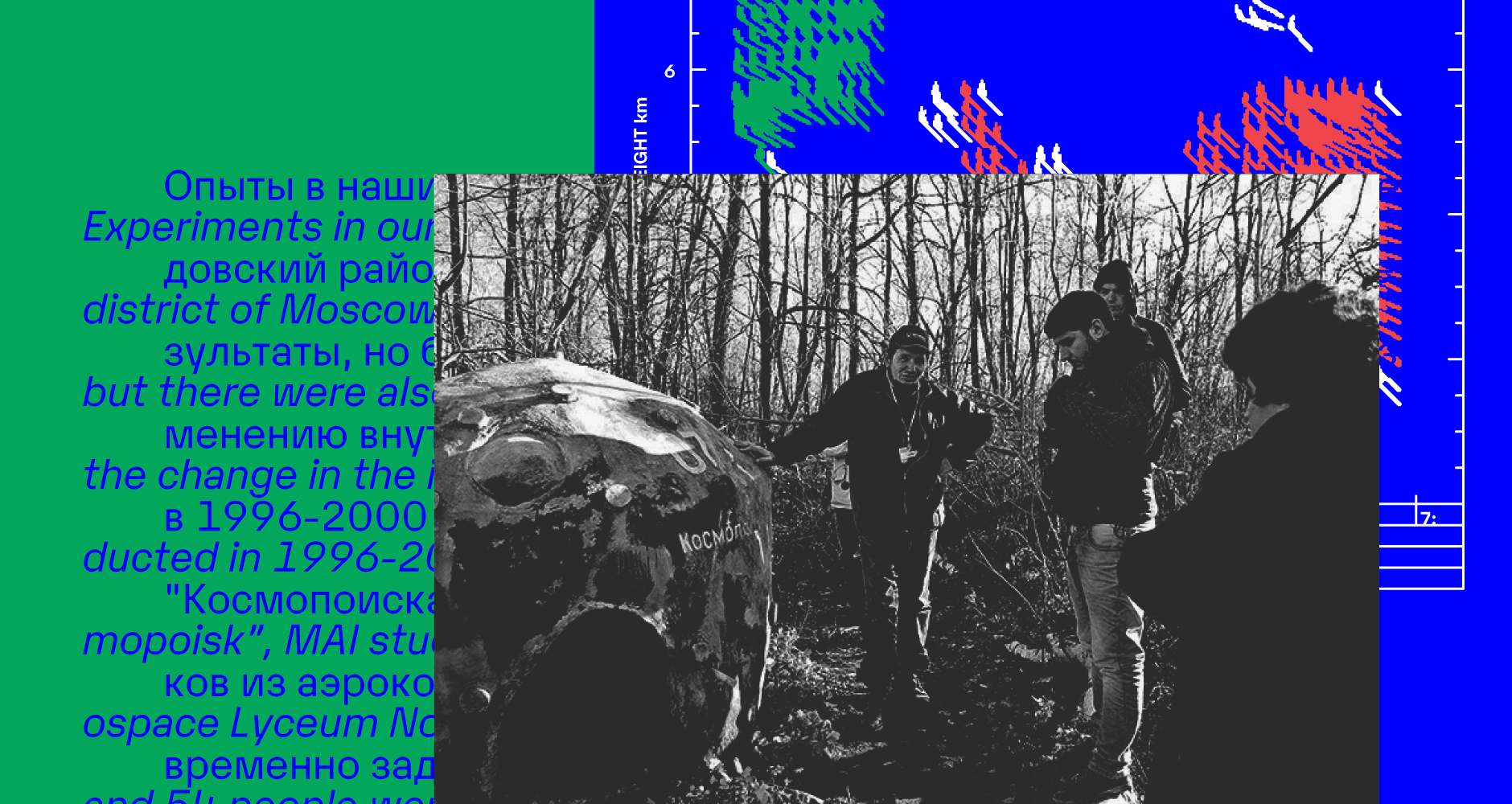
The name Karelia – a modern Russian province and former Finnish territory – hints at the marriage of cultures the design embodies: An engineered Western-European neo-grotesque with an angular appearance reminiscent of Soviet modernist design. About the design
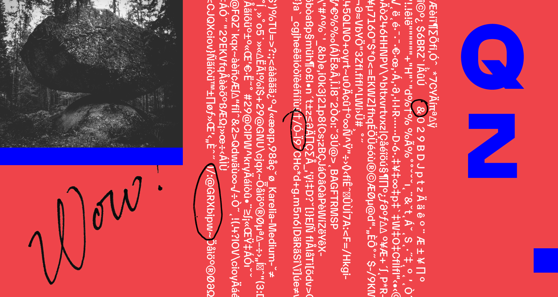
We offer active support for over 200 languages. Read more about our character set.

