Designing Mønster
Almost all serifed typefaces have contrast – thinner serifs than stems, thinner horizontals than verticals. When a type designer every now and then deliberately breaks this axiom, the result normally resembles Wild West-lettering. The so-called French Clarendon is the archetypical example of contrast reversal: In spite of its European name, the style immediately conjures images of tumbleweed, saloons and a lone hero riding westward into the sunset.
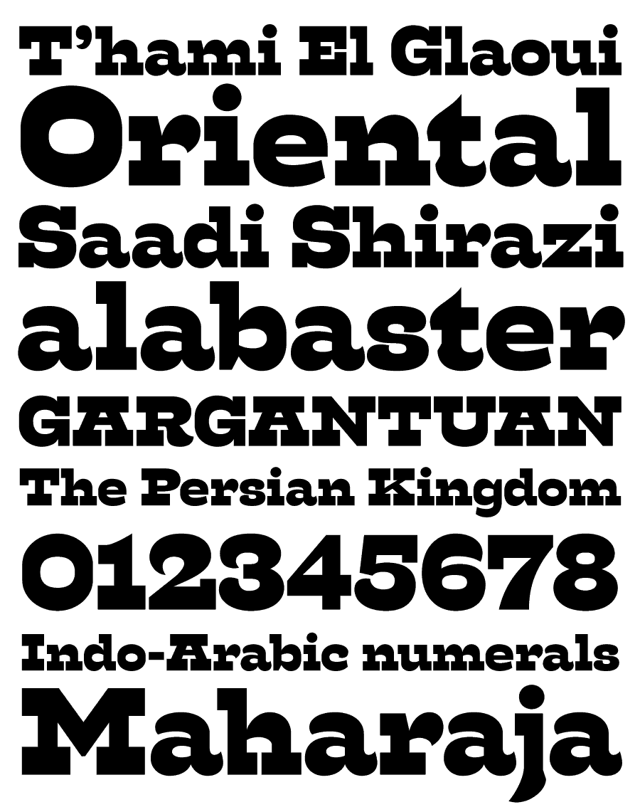
Mønster heads in the opposite direction. While inarguably sporting a very pronounced reversed contrast, its lettershapes are far too unconventional to be mistaken for an Old West-wannabe. The inspiration is more eastern than western – knife-sharp shapes and terminals blend with blunt serifs and bulbously exaggerated curves. Some shapes even vaguely resemble Persian or Turkish ornamental architecture.
But more than anything, Mønster is about creating what its name means in Norwegian: Patterns. Legibility is of little concern in a display typeface like this. What matters is how it looks when woven into words and sentences. Use Mønster for decorative purposes, and tighten its impact by using alternate characters to further even it out.
In type design, the white is as important as the black. Mønster takes this seriously. The white inside the glyphs and the shapes of white between them are all carefully considered; the struggle between black and white creating harmony, fusing the odd forms and exaggerated shapes into something more than the individual basic shapes. Mønster is something akin to an M.C. Escher drawing – the shapes are defined by their context as much as by their outlines.
Mønster is neither pretty nor subtle. It is a beast, an abomination, a freak of culture. In order to maintain backward compatibility, accented characters are not allowed in font names. This single weight typeface will therefore appear by the name of “Monster” in your applications’ font menus. That ambiguity is just right for this instrument of monstrous patterns.