Designing Nordvest
“An original error is worth more than a banal truth”, goes a saying attributed to Dostoyevsky. While the quote appears to be apocryphal (hence true to itself!), it speaks quite nicely to the design of this typeface: Nordvest is an uncommon text face whose development started with a mistake — making the horizontals in a calligraphic italic too thick — which sparked a seemingly simple question: “Why, exactly, should that not work?”
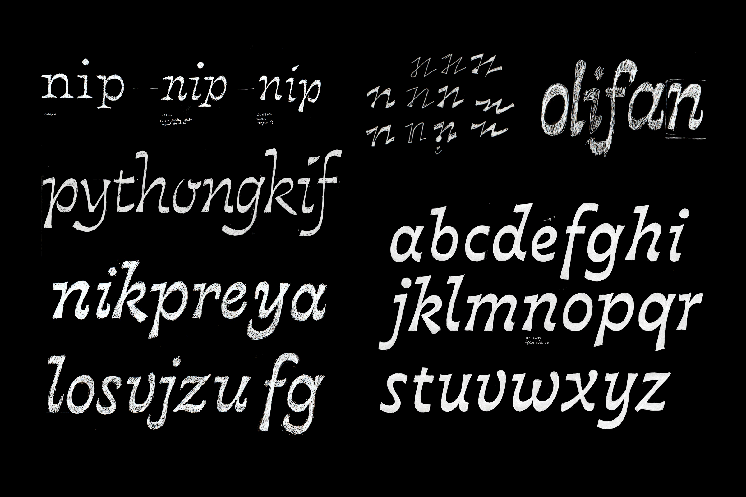
Early sketches for the italic style of Nordvest, exploring the application of heavy horizontals to a cursive structure. A vague idea of these shapes was in my head from early on, but refining them into functional typographic forms would still take months.
It turns out it did work. Nordvest has grown into a fully functional text typeface, despite breaking one of the basic conventions of Latin type design — that vertical strokes are generally made heavier than horizontal ones. Across centuries of type history and a plethora of typographic styles, this general preference of verticals has remained amazingly constant. Its origins can be traced back to traditional writing tools and their usage, but should this provenance also forever chain our letters to this particular arranging of thick and thin strokes? Other scripts, like Arabic or Hebrew, do fine with heavier horizontals than verticals.
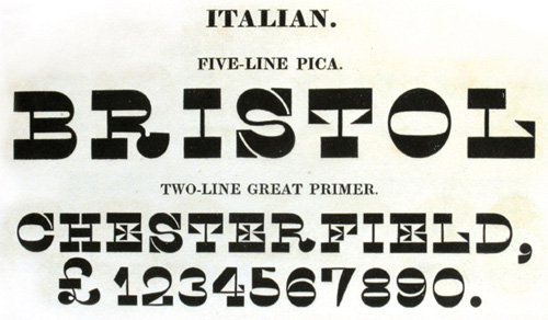
In our alphabet too, designers have attempted time and again to rethink the traditional rules of stroke contrast. Sometimes out of a desire to break the rules so overtly and completely that the result would be outrageous and eye-catching (as first seen in Caslon’s 1821 Italian); later also for functional reasons, by designers like Roger Excoffon or Evert Bloemsma who explored questions of which parts of letters to emphasize for readability. But most commonly, these clunky faces with their big feet and odd proportions stay safely in the display corner, reminding us of “Wanted!” posters, cowboys and cartoons.
Careful refinement and iteration over many months helped find Nordvest’s unique voice.
Nordvest is a restrained approach on this genre that deploys its uncommon weight distribution subtly and smartly, aiming to be useful first and interesting second. Dressed in an organic drawing, the extra weight on its horizontals has been carefully molded and blended into the letterforms so as not to stand out as distracting. The process was an interesting journey to a rarely visited part of design space; the path to these uncommon shapes was twisted, involving hand-sketching, reimagining typographic history, or trying to write with pens held sideways — all leading into months and months of digital iterations, versions and refinements. Two and a half years later, the result is an eminently readable typeface with a unique voice and texture whose lines of text strongly band together. If its reversed-contrast design bears faint echoes of the “cowboy” legacy of the West, it couples this with a Northern European attitude that is more subtle and restrained. Its lighter weights are optimized for text sizes around 11 points, while the black weight is ideally suited for larger sizes and headlines. This targeted, but versatile range should make it interesting for applications in editorial design, branding, or packaging, or any number of other interesting ideas.
Nordvest combines a workable roman with a more flowing, cursive italic. While the regular styles are built for text, the black weight packs more of a punch for display.
The typeface was begun in early 2014 as my graduation project at the TypeMedia master program in Den Haag, The Netherlands, then under the working title “Mica”. After graduation I continued to develop and refine the design. Originally from the Northwestern corner of Switzerland, I had moved North to Den Haag; now, a few years later, I have moved West across the Atlantic to New York. The result of these travels is a typeface that defies expectations to find its own definition of beauty and function.
Special thanks for comments, questions, and critique that made this typeface better: Erik van Blokland, Paul van der Laan, Peter Verheul, Christian Schwartz, Tobias Frere-Jones, David Jonathan Ross, Jacques Le Bailly, my TypeMedia classmates, and of course my colleagues at Monokrom.