Designing Telefon
On the 2017 update
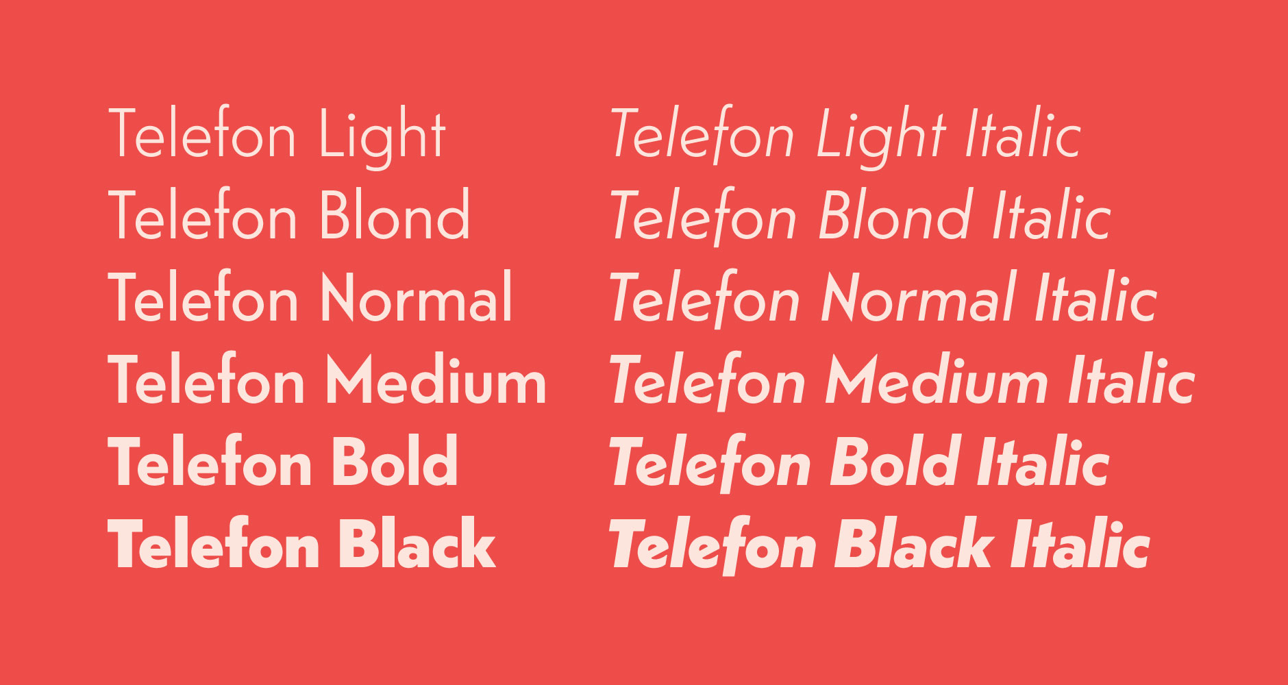
Work on the expanded Telefon family commenced shortly after the initial release in 2012, and rough drafts for the italics and thinnest weights was mostly done when other projects pushed Telefon to the back of the queue. In 2015, the old sketches were once again revisited with fresh eyes, and work began on finalizing the design.

The slanted horizontal bar of 'e' and the descender on 'f', while still retaining fairly geometrically round shapes, are examples of the original design vision that sets Telefon's italics apart from simple shifted obliques.
Updating the fonts to contemporary technical standards brought revisions to the character set, metrics and outlines throughout the family. The rawness of Telefon – its tug-of-war between eye and measuring tape – is a core quality of the design and cause of many internal discussions during the design process. Telefon is a non-conforming, warts-and-all kind of typeface. It does not, however, have much in common with the post-modernist deconstruction of type design principles. It is rather a product of Sindre Bremnes’ ability to embrace strange stylistic details, often discarded by the tastemakers, as the foundation for something completely new and unexpected.
The Telefon italics continues Monokrom’s exploration of the geometrical cursive design space – an area often glossed over in contemporary sans serifs. Telefon’s italics are designed from the ground up, eschewing both the hasty pen strokes of traditional calligraphic cursive and the mechanically derived oblique for structural integrity, striking a confident balance between usefulness and originality.
On the original design
In my childhood there were still lots of bits and pieces left of Interbellum Norway, at least visually: Tobacco logos and sweets wrappers, hand lettering, road signs and train stations, even mastheads on newspapers and magazines — it took quite a while before 30’s functionalism left Norway, never to be seen again. Those letter shapes formed my idea of how letters are supposed to look.
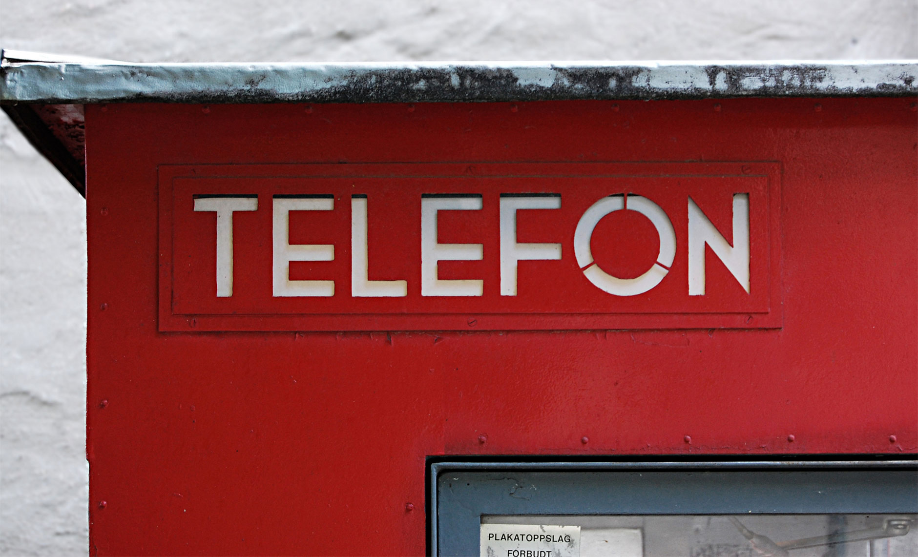
Telefon started with a Christmas gift from my daughter: A book on the original, iconic Norwegian telephone booths, with good pictures, but sadly set in Helvetica. The original lettering was different from that on the remaining ones – someone filed down those gorgeous ‘N’ spikes and neutralised the ‘E’ and ‘F’ crossbars, probably in the 60’s. But my memories of the weird geometry of those six letters TELEFON (I deliberately didn’t look at them while drawing) became the inspiration for what eventually turned into a typeface.
When drawing type, I never make any sketches. I start drawing directly in the font editing program I use, often not having much of an idea what I am going to draw. Telefon was actually the result of me teaching myself how to construct a geometric typeface.

The original die cut lettering on Georg Fredrik Fastings Riks telephone kiosk.
A good share of Norwegian street signs are still of that old variety; the typeface a weird cross between the DIN types and more geometric shapes, to some degree resembling Jakob Erbar’s eponymous typeface. The new ones are of course vastly inferior in all respects, since hardly anyone knows typography in Norway anymore.
Telefon is my first completed design, which probably makes me a member of the not-so-exclusive club of type designers who choose some kind of geometric sans serif as their first typeface. However, it is easy to underestimate the challenge of making a geometric typeface readable, attractive and interesting. In fact, it is very hard. I’ve tried redeeming Telefon by making it friendlier than Futura: the proportions are less severe, the corners are soft, the two-storey ‘a’ and the rather loose spacing makes it useful for more than display typography. You could even set a book in Telefon; it would actually be the perfect choice the next time someone writes a book on the Norwegian telephone booth.

