From curves to pixels
With the advent of @font-face, the future of type is increasingly the web and on screen. Still, the highly refined curves of a typeface does not necessarily translate well to the crude pixel grid, especially not at smaller sizes.
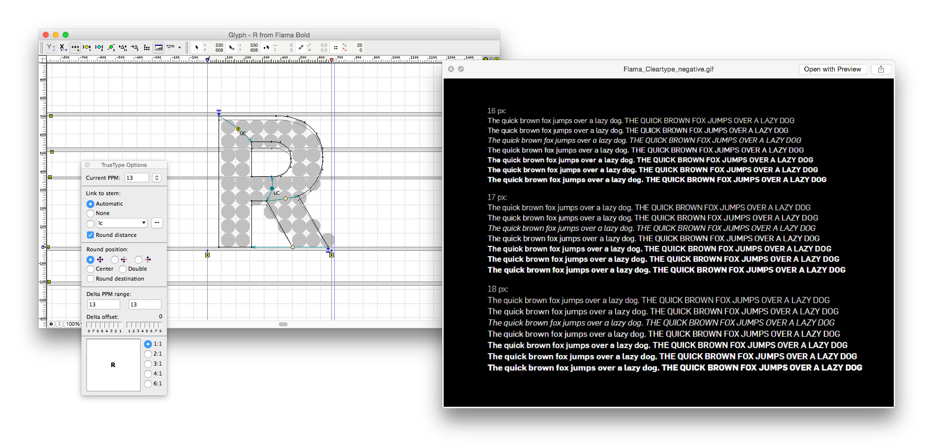
We delivered the TrueType hinting for Mário Feliciano’s Flama family to be used on the new TV2 website.
Adapting type to crude reproduction is nothing new in the world of type design, and much of the knowledge we incorporate in our Screen series is borrowed from small size masters designed for print. Modifications to the letterforms are made to increase apparent size, counteract ink spread (or, in this case, pixel blur), and adjusting for optical effects. Type on screen also comes with some additional challenges, like loading times and rounding errors.
Our commercially available web fonts includes special instructions called “TrueType hinting”, helping the computer to decide how to round the letters to the grid, and what pixels to turn off or on at different sizes.
We offer TrueType hinting services for type designers and corporations, and can also assist in the process of making small-size adjustments for text fonts on screen. Please contact us for a quote.