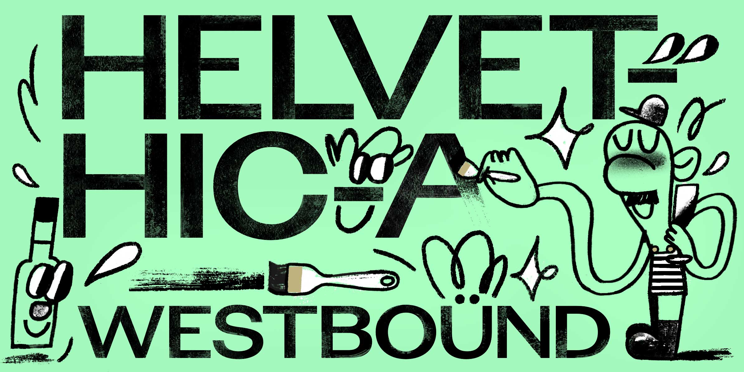

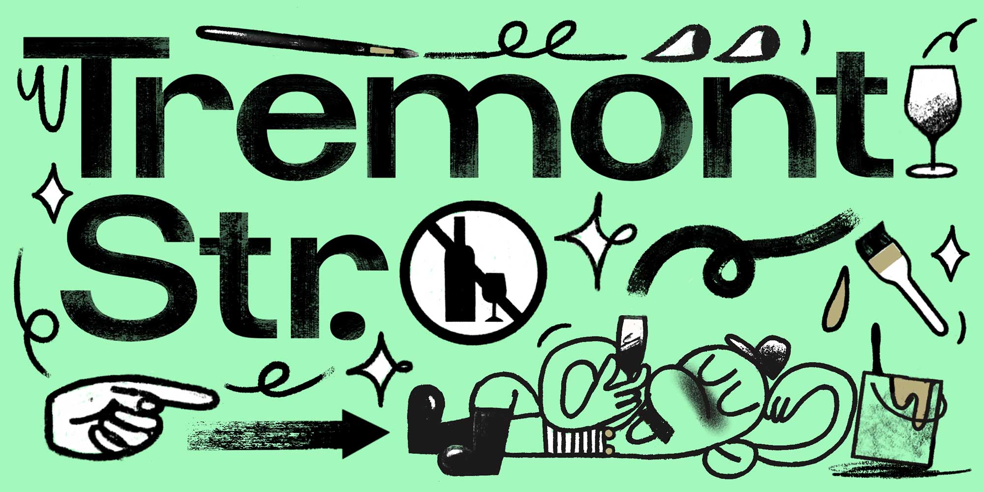
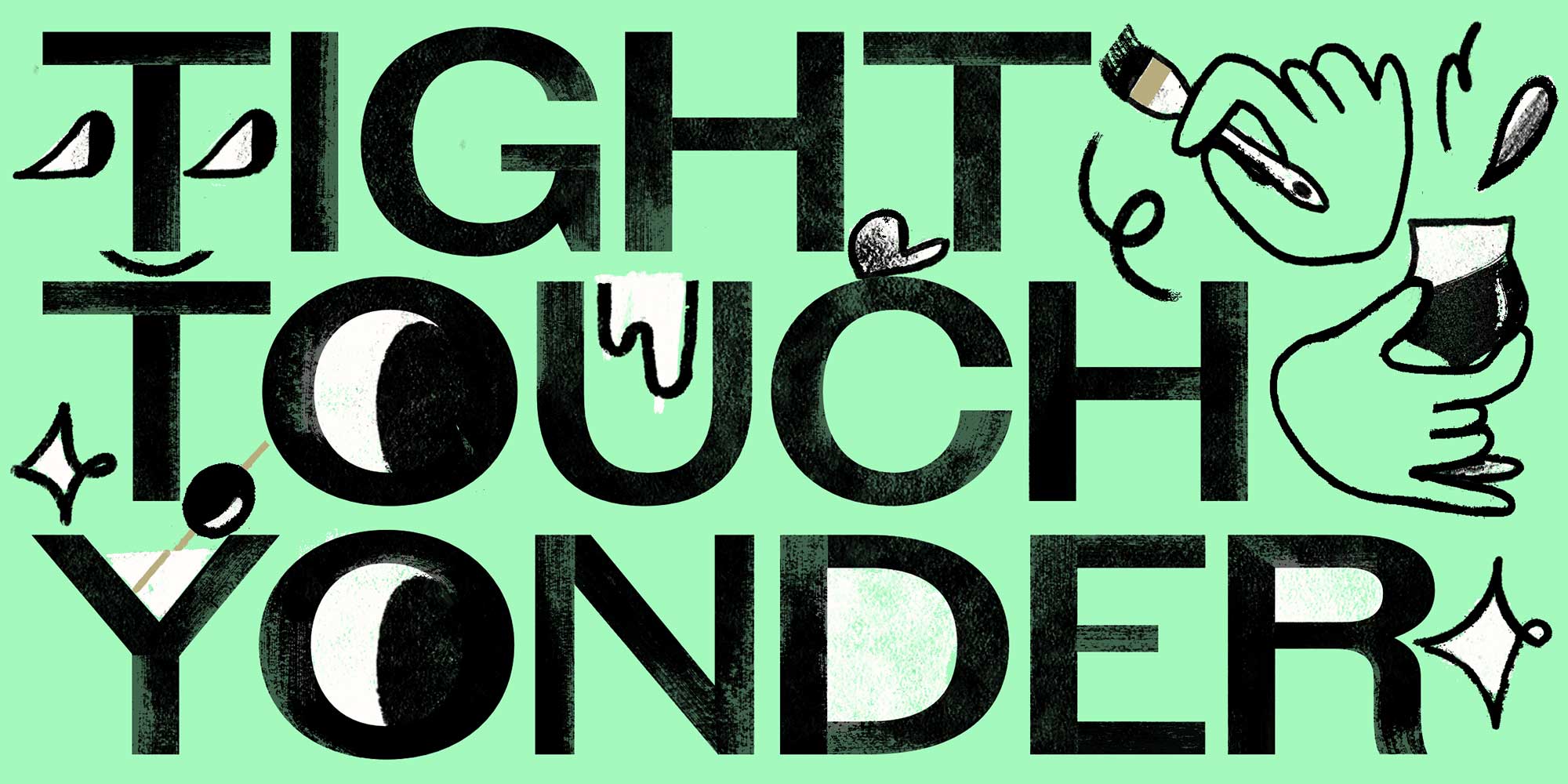
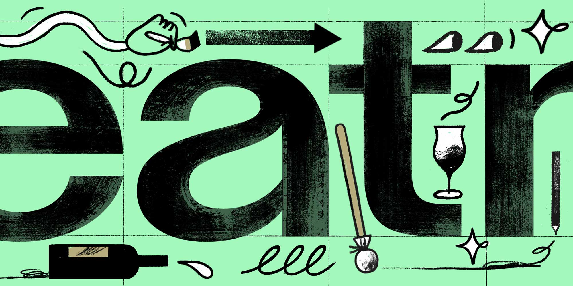
Avgarde
Pour Walter Käch a hefty dose of schnaps and give him a flat brush: Avgarde is the drunken sign painter’s grotesk we’ve all been waiting for. Spacing is sleeping one off, leaving Kerning the designated driver. You probably want to keep an eye on the Proportions – they’re all over the place. Balance fell down the ladder, but suffered only a minor concussion. We patched him up good. Say, what’s the problem, officer? Can I walk a straight line? Well, hold my beer!
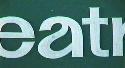
The source that triggered Avgarde: the letters eventually turned out to originate from the Boylston light rail station in Boston’s Theatre District. Photo by James “Kibo” Parry.
Nothing beats a highly overconfident and massively underqualified sign painter attempting to paint large-scale Helvetica-style letters on a vertical surface. The spectacular specimen on display at the Boylston light rail station in Boston was just the medicine designer Frode Helland needed after emerging from an extended deep dive in the annals of stuck-up Swiss modernism.
From a tiny snippet – three droopy characters, and the slightest hint of an arch – Helland has composed a glorious cacophony held together with duct tape and baling wire. When more samples surfaced later, revealing how the rest of the sign actually looked, the damage had already been done.
The new typeface has just one cut, and the character set isn’t all that (on account of the 1,700 lines of triplet kerning patchwork under the hood), but the engine’s running, we promise. Avgarde is an alternate spelling of avgårde – av + gårde, literally “off [the] farm.” A better translation reads: Let’s go!
Designer: Frode Helland
Copy editing: Caren Litherland
Illustration: Aina Piao
Released: 2023
Format: OTF, WOFF, WOFF2
Please refer to the specimen PDF for character set details.