Numera
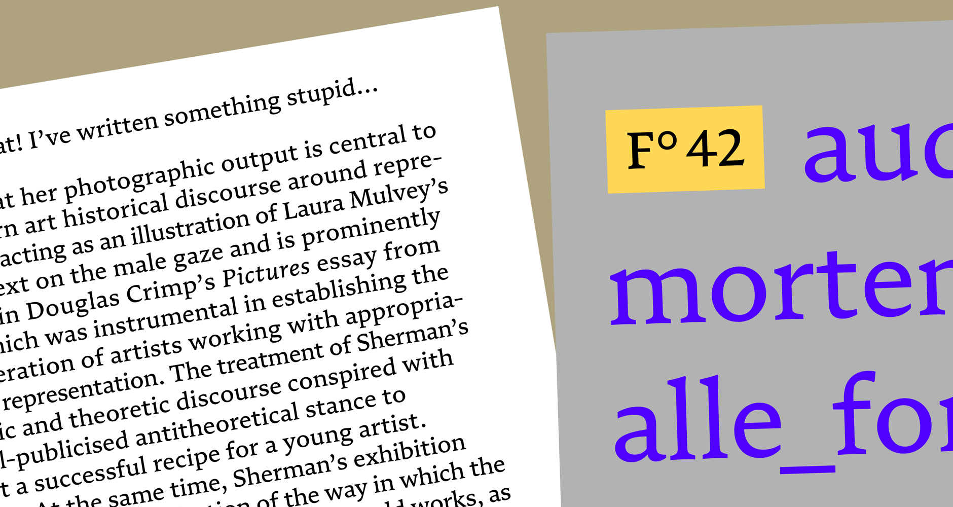
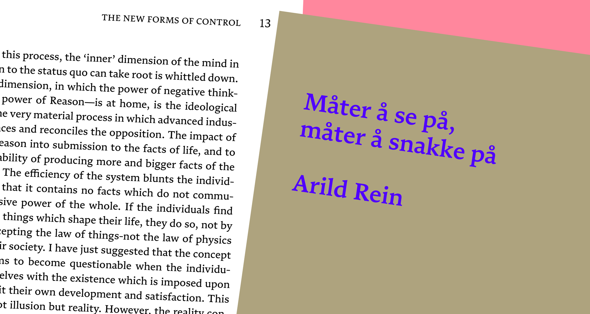
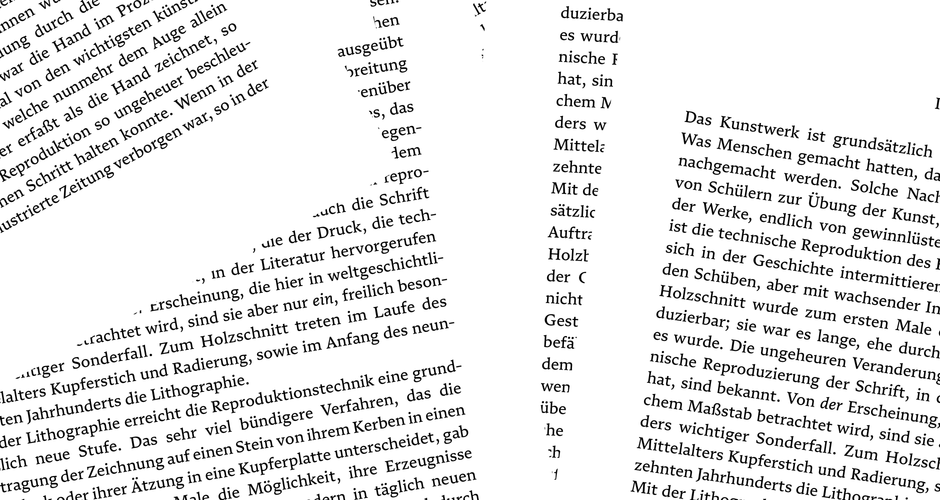
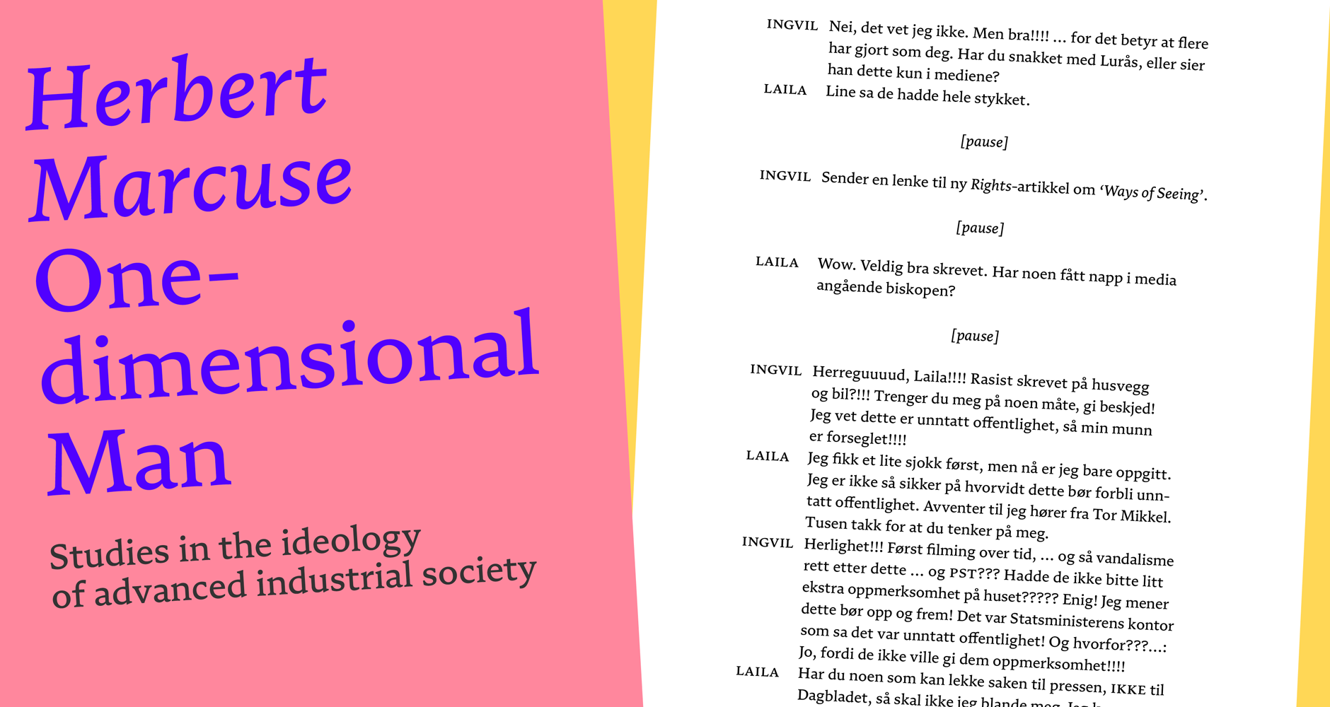
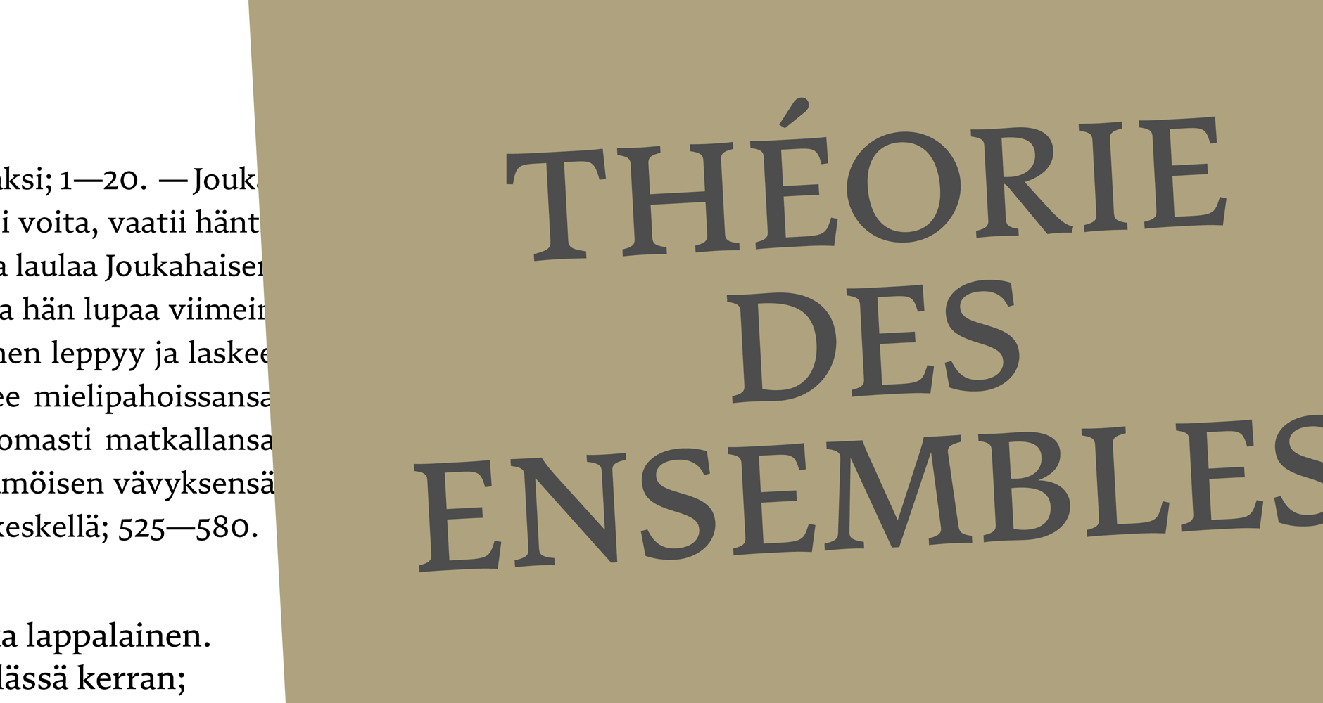
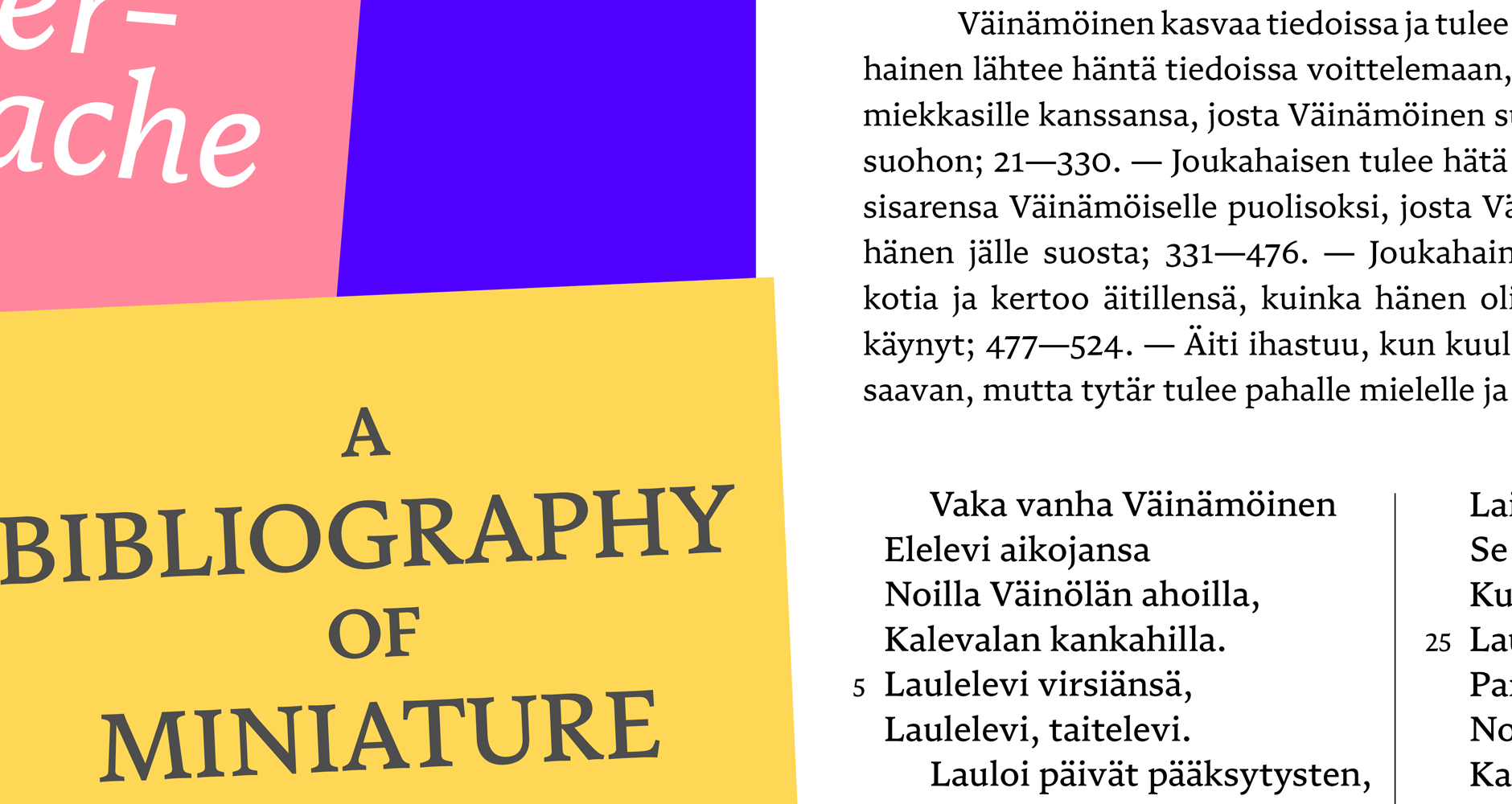
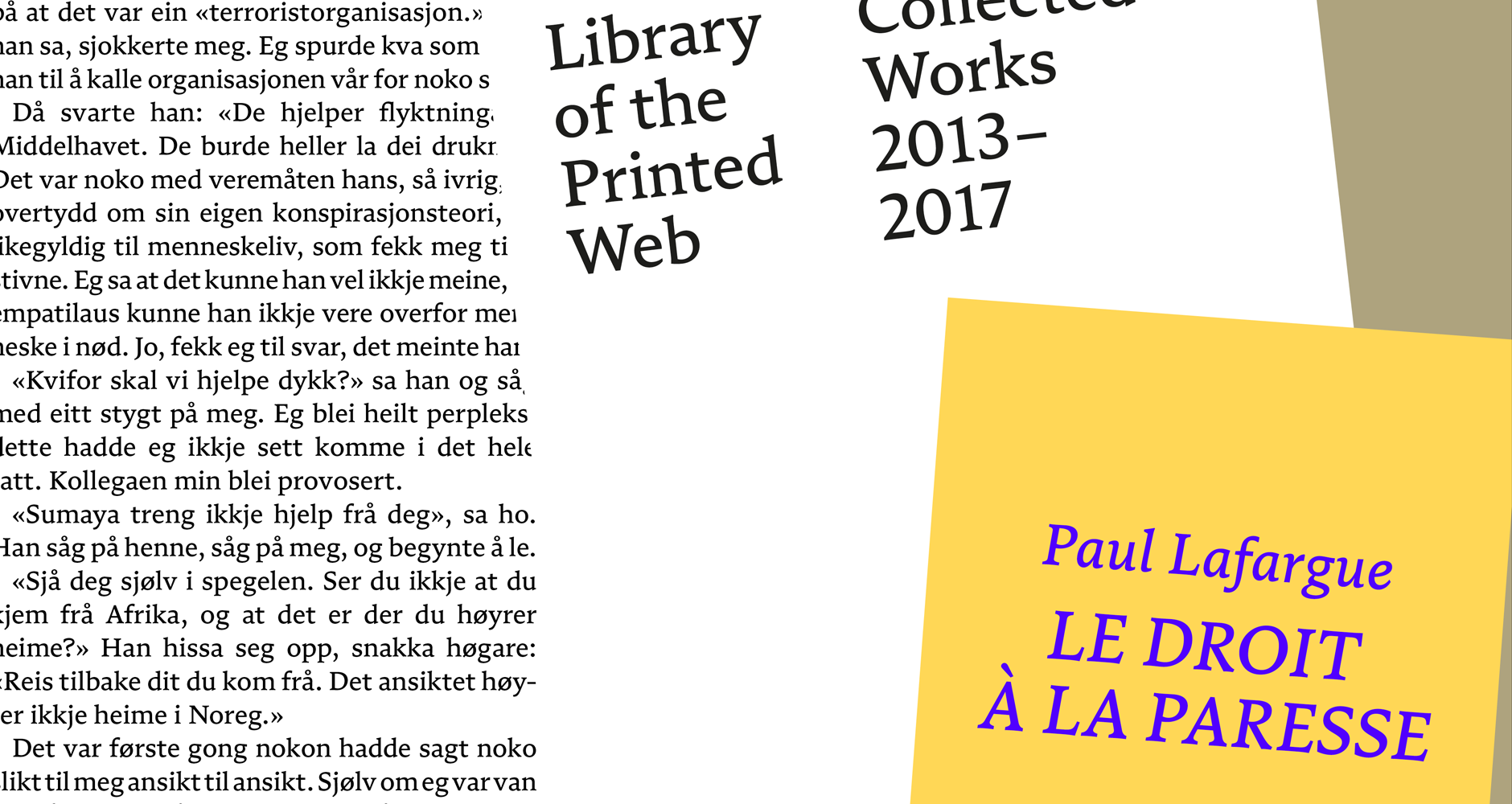
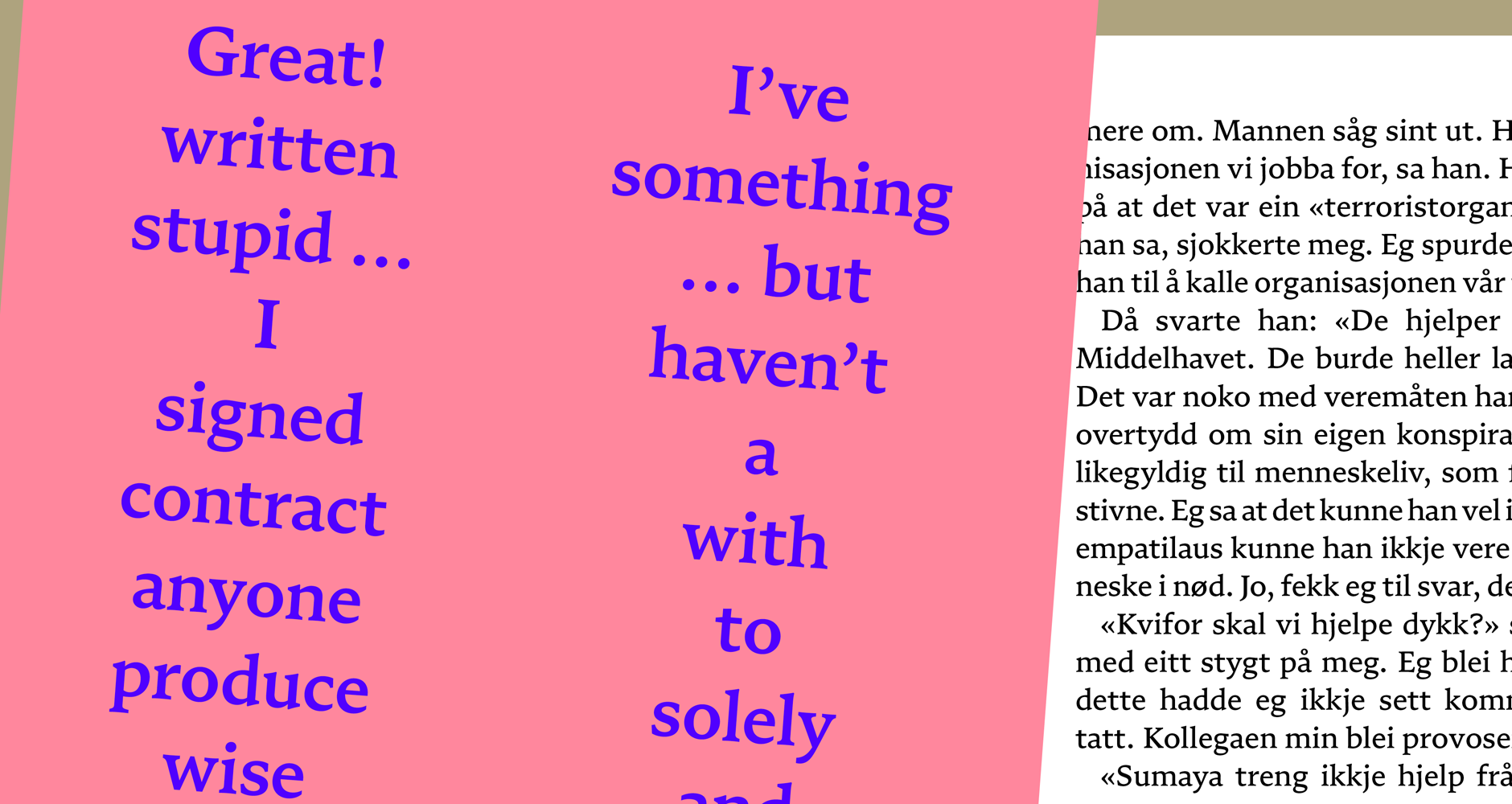
Numera is a brand new take on a traditional recipe – a sourdough Brotschrift, grown out of centuries of craft and culture, but with a new distinct flavour. It comes in five weights plus italics, and is carefully balanced in the middle range for refined text setting. It is designed for book typography, but can carry that reliability easily into other purposes.
Numera is grounded in the tradition of literary typesetting, which is among the greatest challenges for a type designer. Still, it does not feel old or, in fact, traditional. This is the paradox of good type: familiarity and originality are constantly at odds, and some of these qualities are cultural, some are technical, and some are fashionable. What is expected of a text typeface is in itself a question without a clear answer.
Throughout his career, Helland has been searching for ways to subvert expectations and to find new methods in an old craft. In Numera, both passions come together. Its visual language is not driven by any single historic principle, but rather by texture and the continuity of curves and shapes. Numera is a natural balancing act between static and dynamic tension, and it brings vibrancy to every shape.
In a 2018 exhibition, Helland lifted the veil on the ongoing process, plastering the gallery walls with annotated proofs, screenshots, sketches and references. In this decade-long project, Numera came to be redrawn again and again, every iteration slowly improving on something practical, while never losing sight of the original essence.
Today, after ten years of work, Numera stands as a testament to experiment. A text typeface with familiarity and originality in delicate harmony. Its slow and fast curves and mercurial tension give designers a lot to work with. Its ten styles provide range, its texture is reliable, and its imprint brings something new to the tradition.
Designer: Frode Helland
Design assistance: Inga Plönnigs
Released: 2021
Format: OTF, WOFF, WOFF2
Graphics: Benjamin Hickethier, with permissions from Villhund forlag, Samlaget, Magnus Voll Mathiassen, Aslak Gurholt and Torpedo Books.
2018 process exhibition

