Designing Satyr
Curves are hard. Even harder, I think, is making curves and straight lines work well together. And hardest of all is making the transition from line to curve look good. So one day, after a long period of trying to draw type with as few curves as possible, John Downer-style, I tried to go the other way, eliminating not the curve but the line.
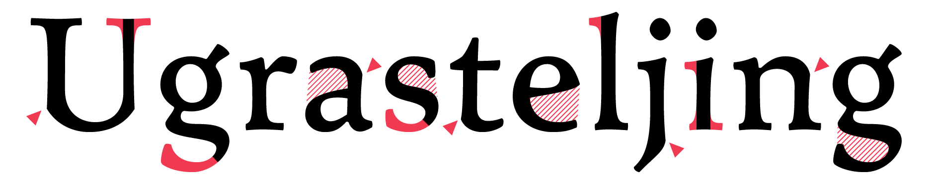
Open apertures inject air into Satyr’s letterforms, and the corners resulting from its concave/convex tension highlight important features.
I had just started sketching a loose, round and wide typeface; in fact a half-serious attempt at leisurely crafting something akin to Mrs. Eaves. But the process of changing its already few line segments into curves really fired my imagination. From then on my not yet born typeface seemingly started drawing itself.
But there’s more to Satyr than the lack of straight lines. Although the proportions are vaguely Venetian and the contrast obviously renaissance-influenced, the typeface still can’t be put in any of these coarse categories. The ‘e’ and the ‘a’, most typically, show reversed contrast — the vertical thins seem to change their mind halfway. This trick is applied to most lower case letters as well as the numerals. The same principle is used in the italic, though in a subtler way.
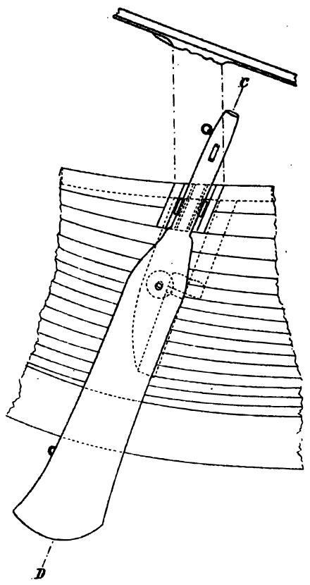
Steering oar from the 8th century Gokstad ship. Satyr was inspired by traditional boat building.
These traits give Satyr a handmade, organic look. It also makes it appear lighter on the page than the average stem widths should indicate — the inside curves inject more white space into the glyphs than stems with parallel lines do.
The standard three-storey lowercase ‘g’ is a bastard. It is flawed. It cannot be done right. To make it work at all, it has to be drawn too light, because of the overly complicated, doubly closed form. It looks especially clunky in a typeface with big, gaping apertures, like Satyr. So I opened it up, allowing much more air into the shape. This is different than the open lower-storey of, say, Baskerville, which is more ornamental than functional, since the overall shape still follows the old topology, only with an unexpected gap. The Satyr ‘g’ is open for purely functional reasons; to simplify the shape, to make it lighter, and to give it some resemblance to that other lowercase loner, the ‘s’. In Satyr, these two misfits are close friends.
Although Satyr might seem quirky in most respects, it really is a workhorse book face, intended for a point-size of ten or eleven. With its stubby appearance and exaggerated details, it is really not meant to be set big. That suits its unfaithful companion Faunus a lot better.