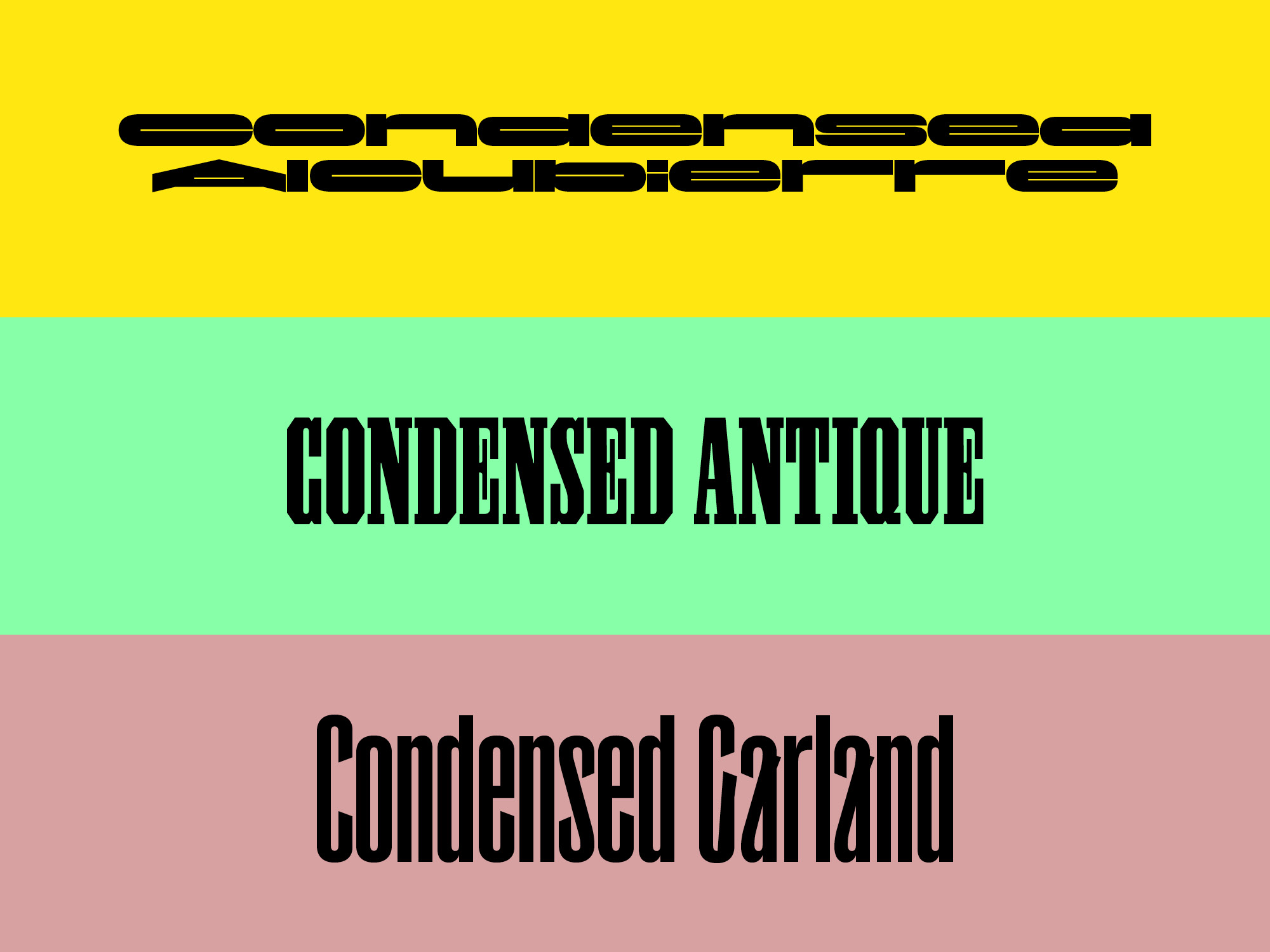
New: Condensed is an ongoing exploration of display typography delineated by spatial constraints rather than formal resemblance. The latest additions to the family are Alcubierre, Antique, and Garland.
• Learn more about ⮱ Condensed here
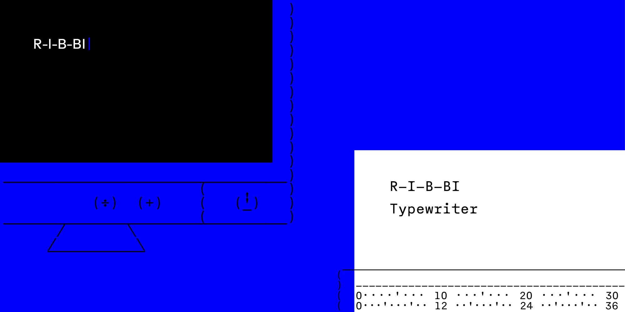
R-I-B-BI composes the nuclear font family – Regular, Italic, Bold, and Bold Italic – on each side of the digital divide by utilizing the mechanical limitations and digital manipulations of a bygone era.
• Learn more about ⮱ R-I-B-BI
Though solemn in appearance, Diploë is playful in application. Monokrom’s new sans serif family is conceived as a variable spectrum, ranging from narrow to wide, light to black, covering roman and italic styles, as well as intermediate postures. Individual fonts are available in three widths, counting seven weights each, for a total of fourty-two styles.
• Learn more about ⮱ Diploë
• Explore the ⮱ Diploë Minisite
The debut of the neo-grotesk was also the precise moment of its ideological demise. Motorik, now out from Monokrom, offers a new perspective on this formative moment in design history: the immediate neutralization and appropriation of the democratic ambitions central to modernist thinking on the eve of its birth.
• Learn more about ⮱ Motorik
• Further reading ⮱ The cult of the sans serif
Avgarde is the drunken sign painter’s grotesk we’ve all been waiting for – a glorious cacophony held together with duct tape and baling wire … and 1,700 lines of triplet kerning. Let’s go!